Brand Identity Design for Watson Vegan Truck
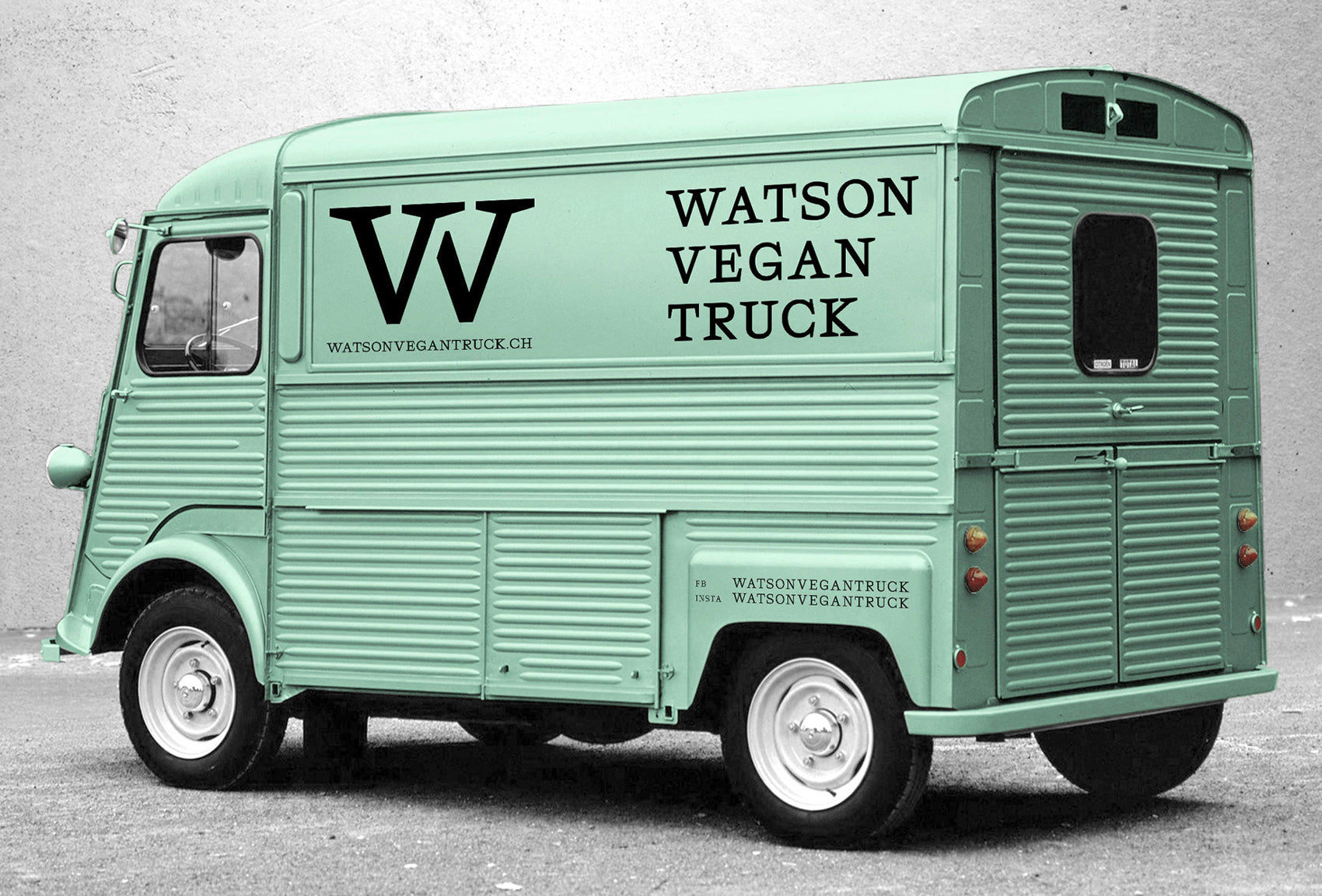
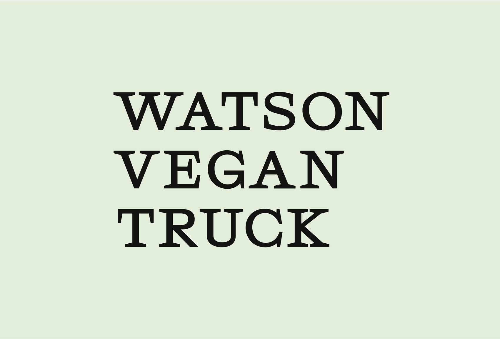
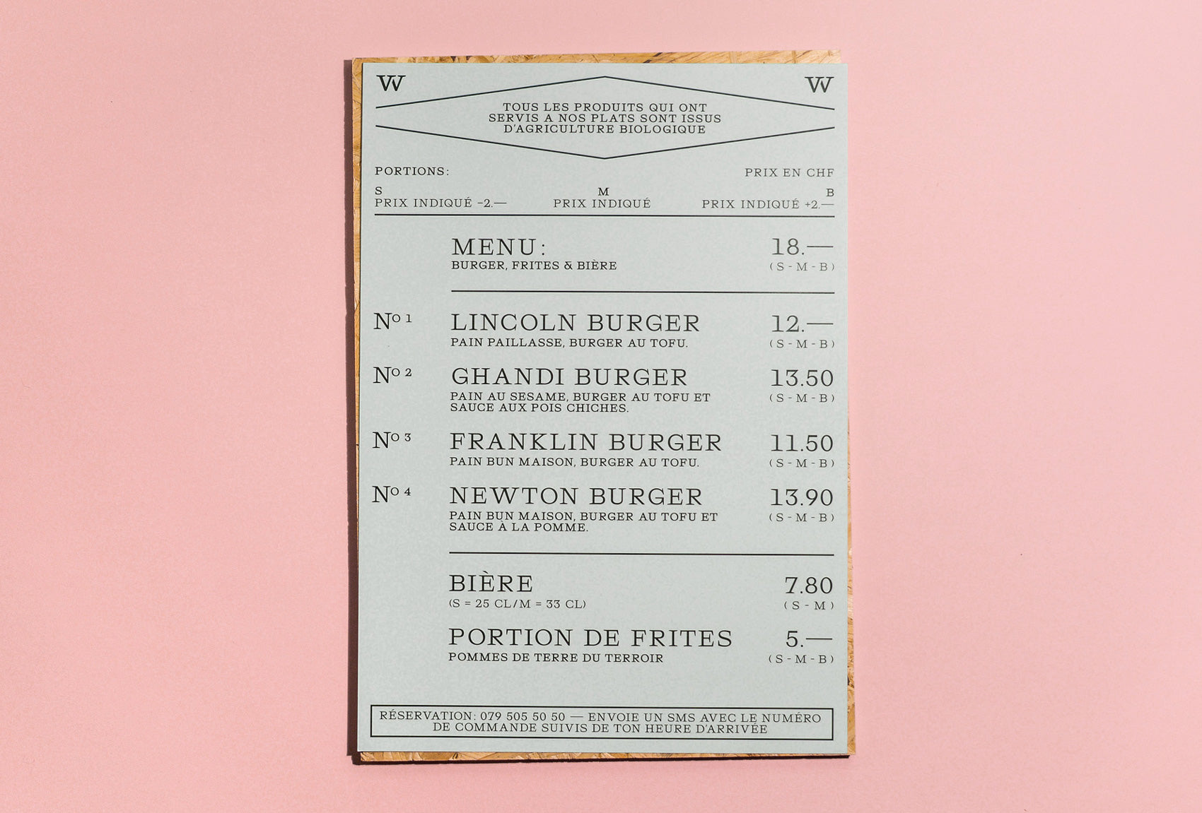
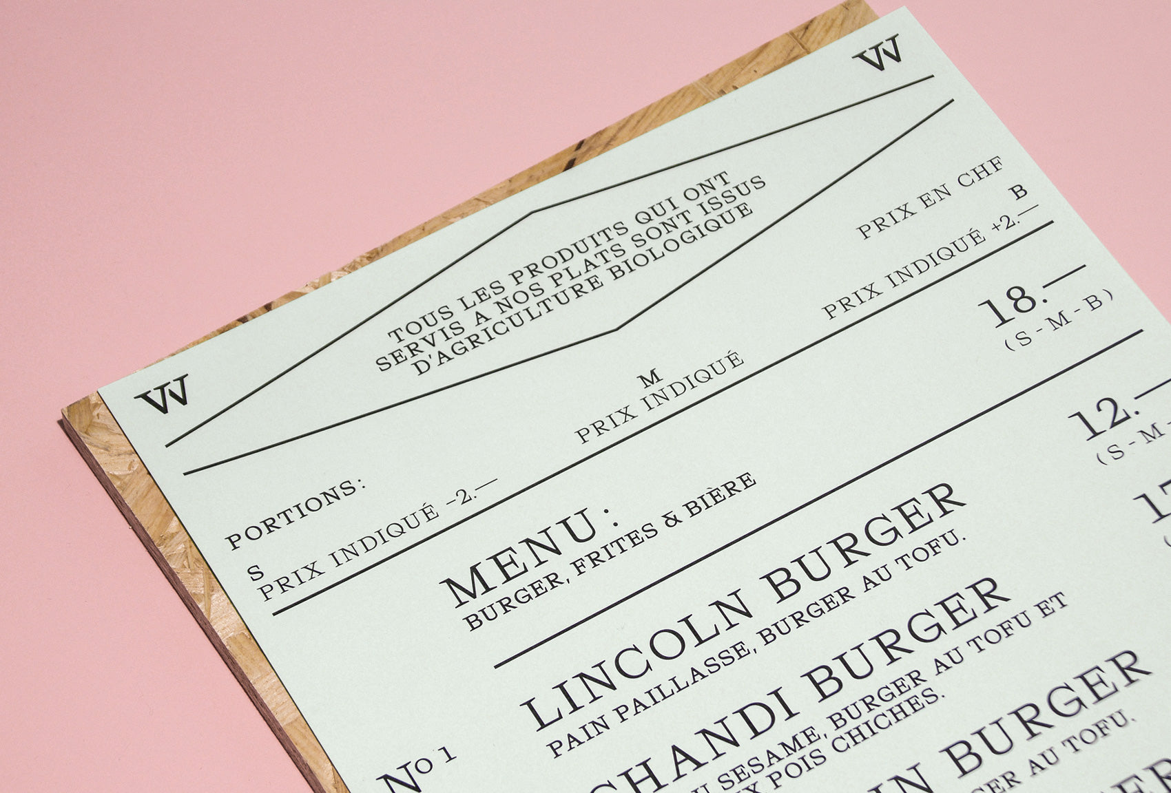
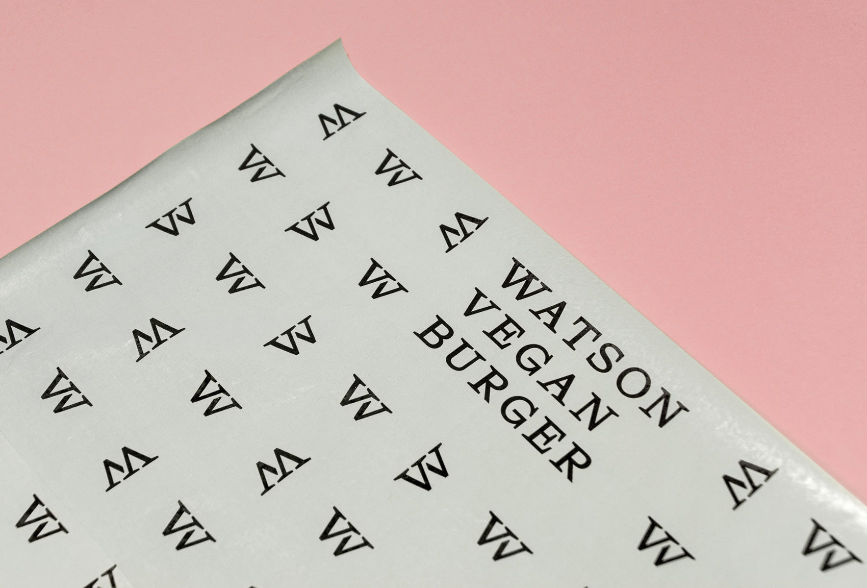
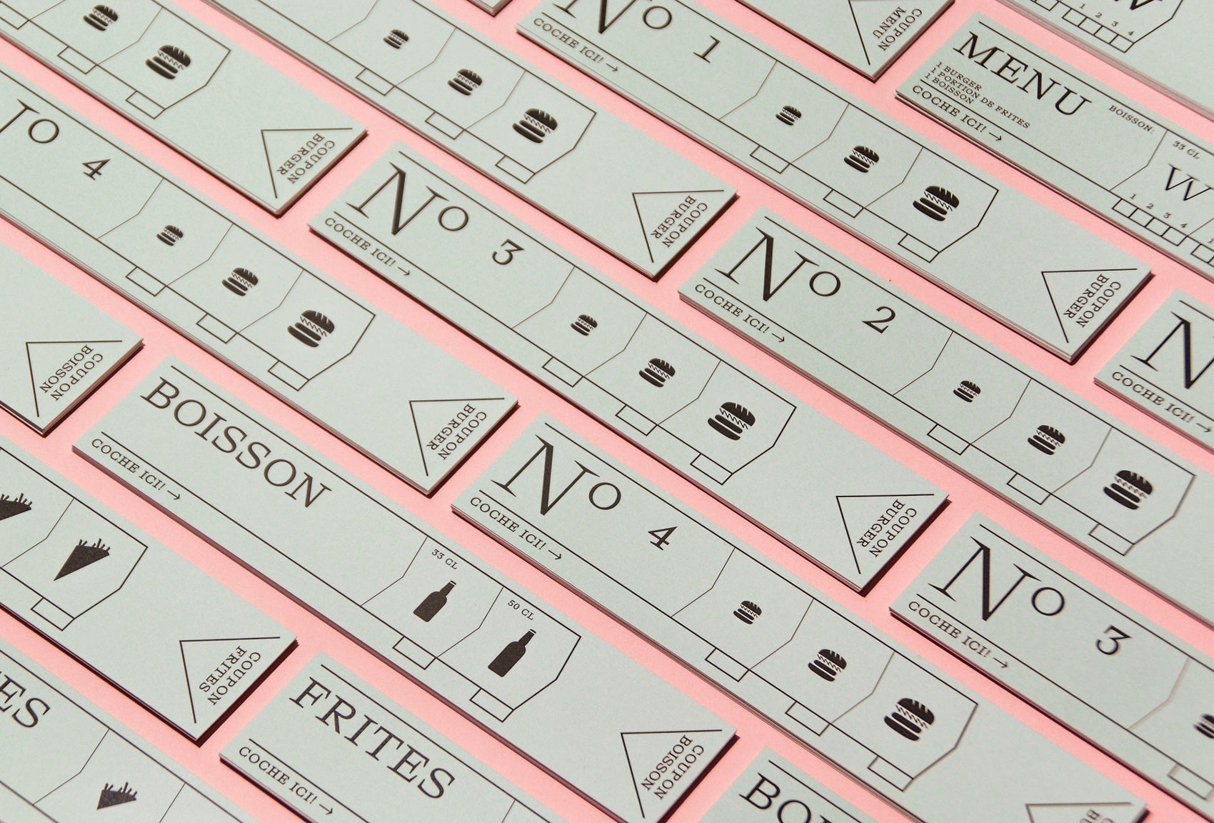
This new identity for Watson Vegan Truck captures a unique style for the edgy vegan food market. Designer Donovan Bernini has masterfully created a slightly retro premium feel, by using a careful blend of serif typography and subtle paste colours. The graphic simplicity of the word mark and monogram feel effortlessly cool. The translation of the design through to vehicle signage and menus is a stroke of genius, I'd definitely stop to sample a burger if I saw this - and I'm not even Vegan!



Leave a comment
Comments will be approved before showing up.




Andrew Smith
Author
I am a Creative Director living and working in New Zealand, I have a special interest in travel and landscape photography, I also produce presets for Adobe Lightroom.