Alchemy Jewellery Branding | Design By Simple

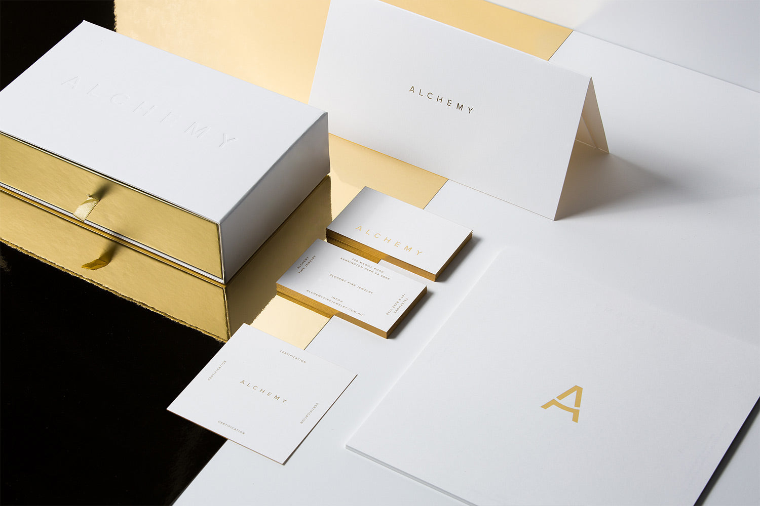
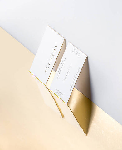
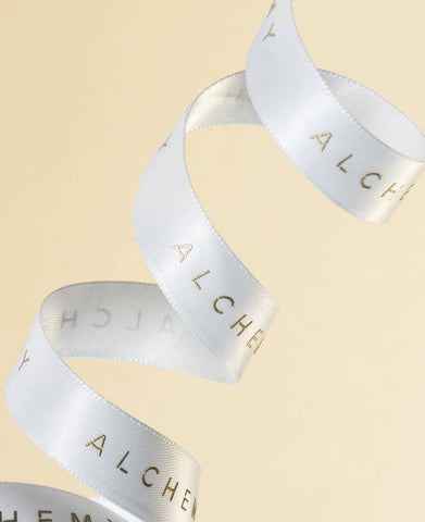
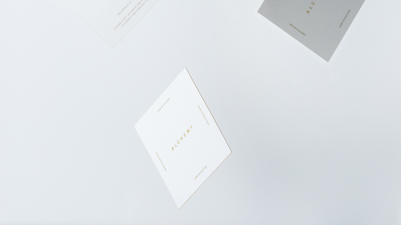
Simple engaged by Alchemy to refresh their jewellery brand and infuse it with a luxurious, fashion-focused minimal design style. At the centre of the solution was a befitting gold colour palette. The gold theme was played out through print production processes by introducing gold foils, gilding and other non-standard printing techniques.
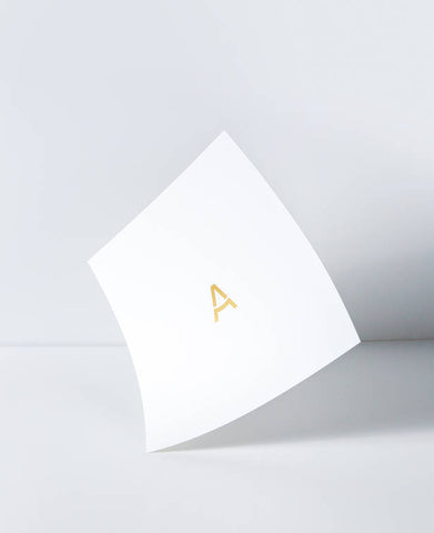
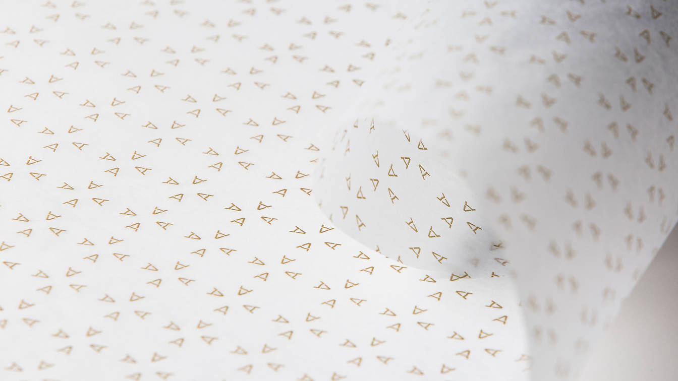
The brand mark also needed to be simple enough that it can be legibly pressed onto jewellery items, as small as the inside rim of a ring - and of course legible on screen with all digital platforms. The mark also needed to survive being repurposed as a distinctive brand pattern for use across packaging and other touchpoints. The visual identity was eventually rolled out across interiors, packaging, stationery and all digital platforms. Every touchpoint has been skilfully constructed to help reinforce the feelings of luxury, sophistication and style.



Leave a comment
Comments will be approved before showing up.




Andrew Smith
Author
I am a Creative Director living and working in New Zealand, I have a special interest in travel and landscape photography, I also produce presets for Adobe Lightroom.