Minimal Business Card and Stationery Design
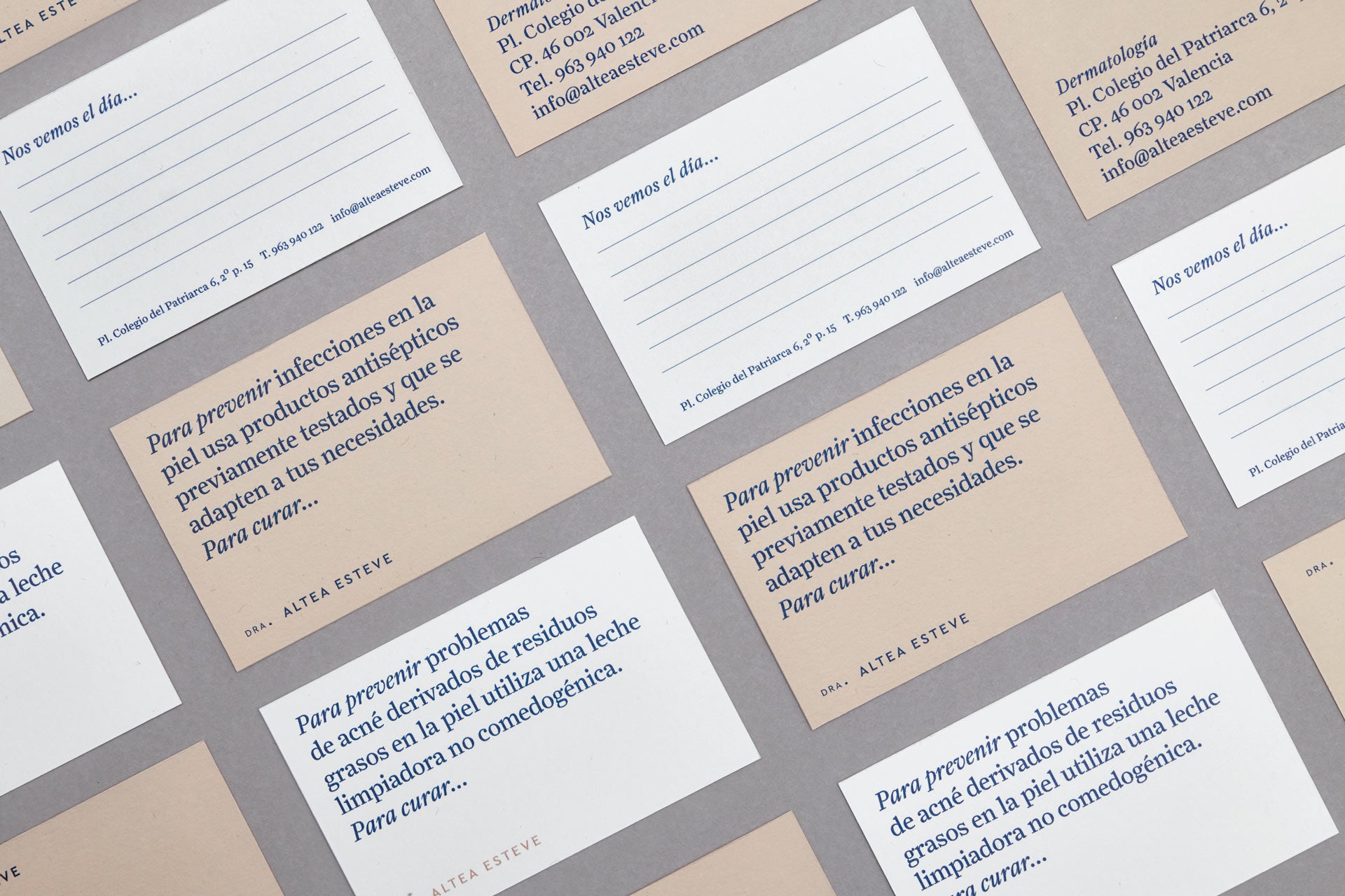
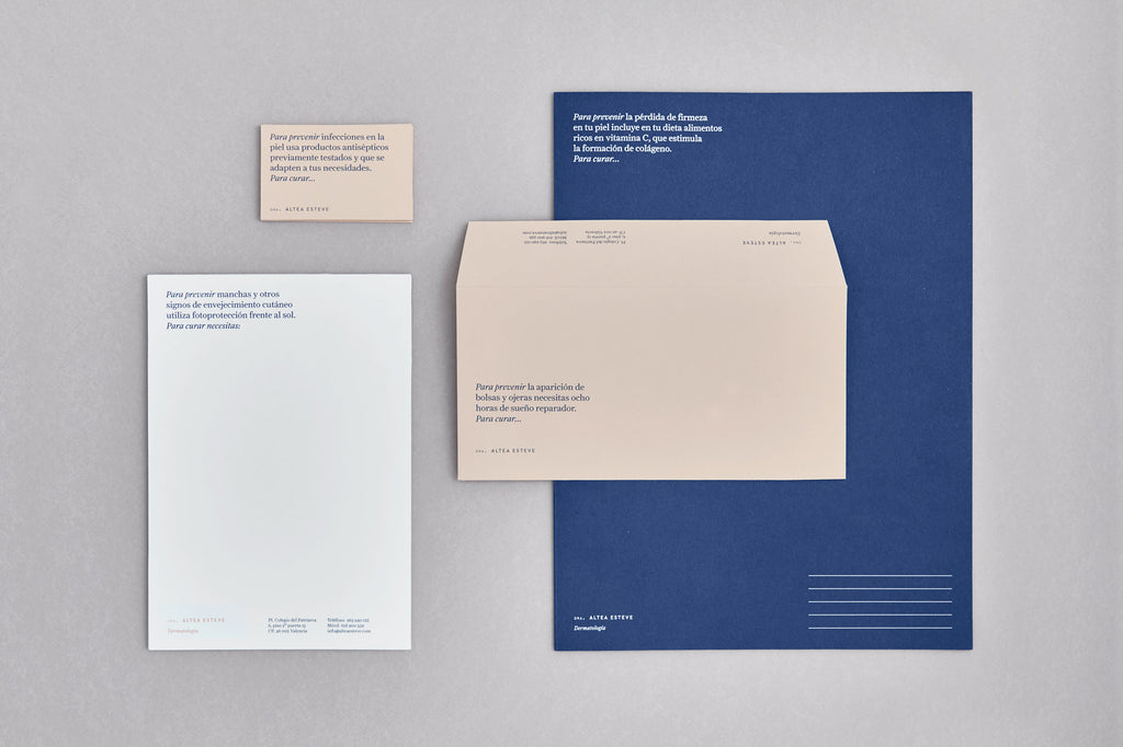
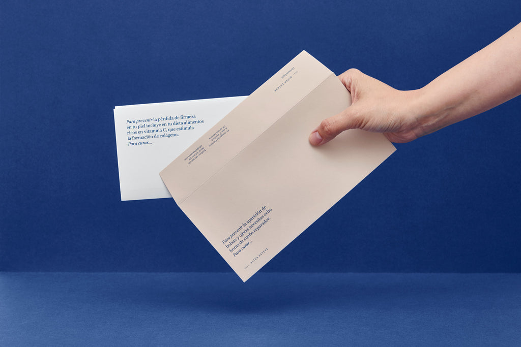
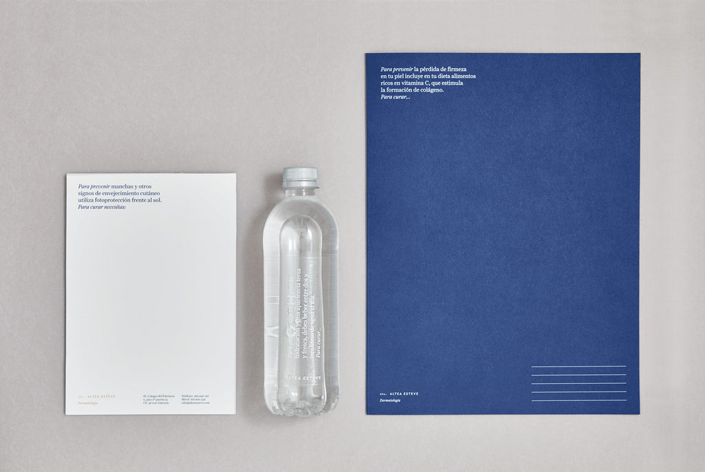
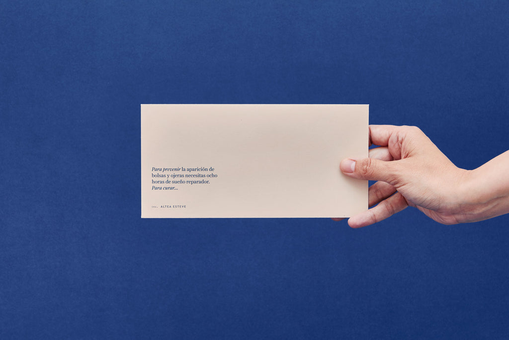
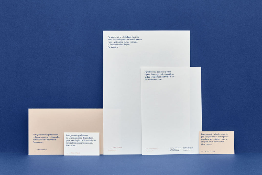
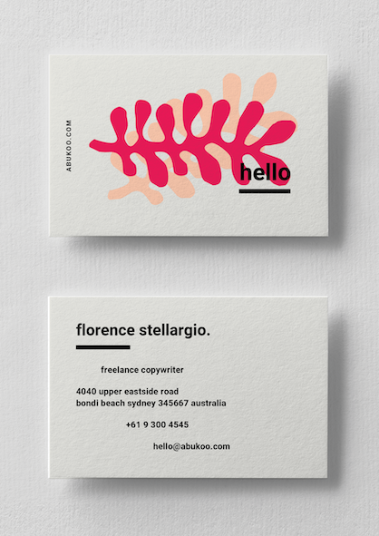
This minimalist business card and stationery design for Altea Esteve was intended to help differentiate Altea Esteve from her competitors - she needed a highly credible, fresh and original identity that would continue to grow her presence in the market.
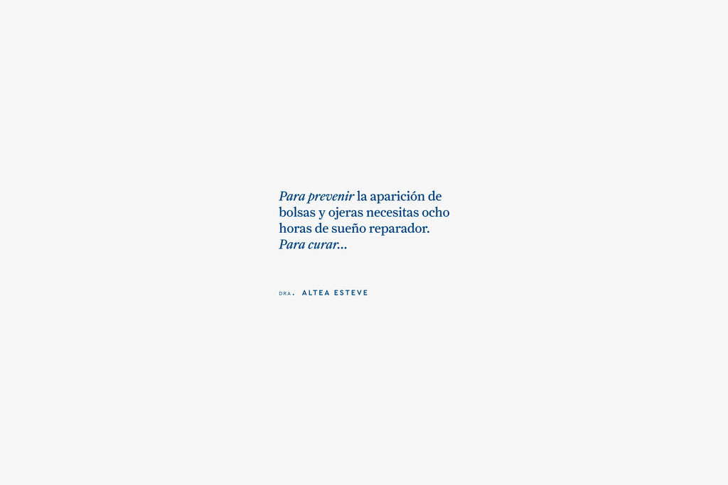
The use of simple typography and minimal colours has helped create something clean and memorable. The design and typographic style translates immediately into a strong no-nonsense brand that projects an enormous amount of trust and sophistication.
This project was created by fasestudio

Leave a comment
Comments will be approved before showing up.




Andrew Smith
Author
I am a Creative Director living and working in New Zealand, I have a special interest in travel and landscape photography, I also produce presets for Adobe Lightroom.