Minimal Typography | By Nick Barclay
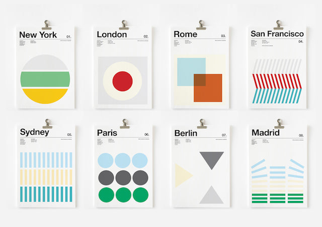
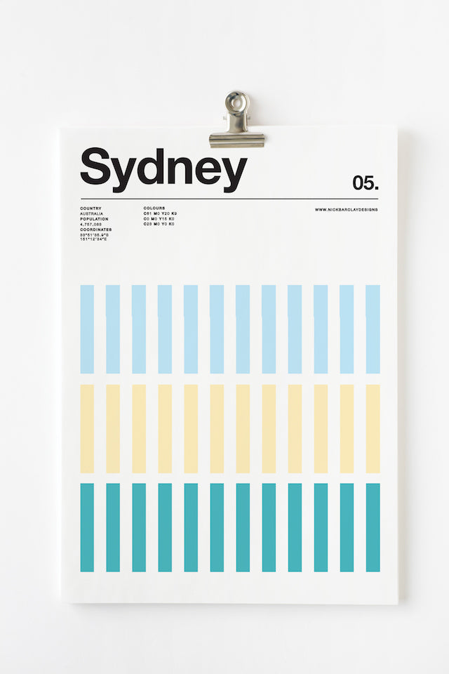
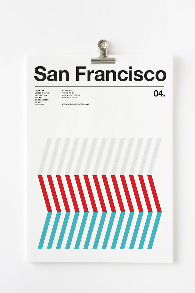
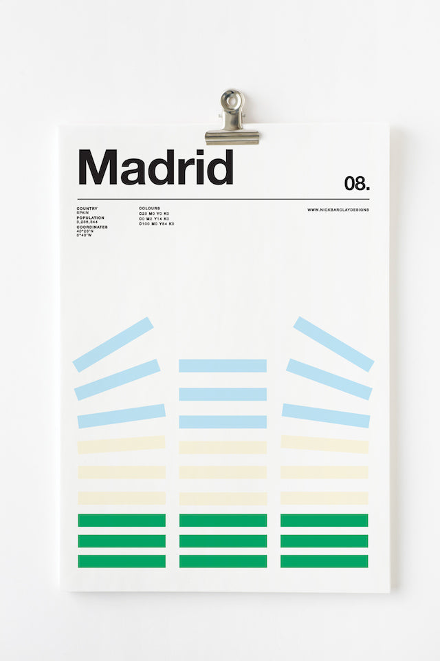
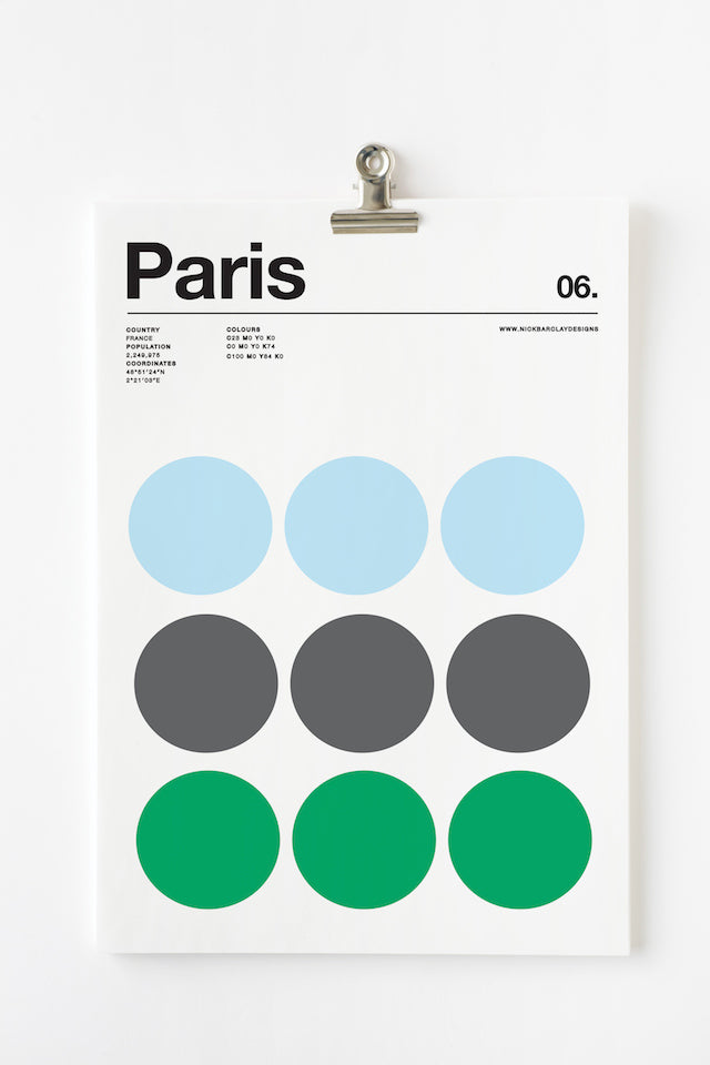
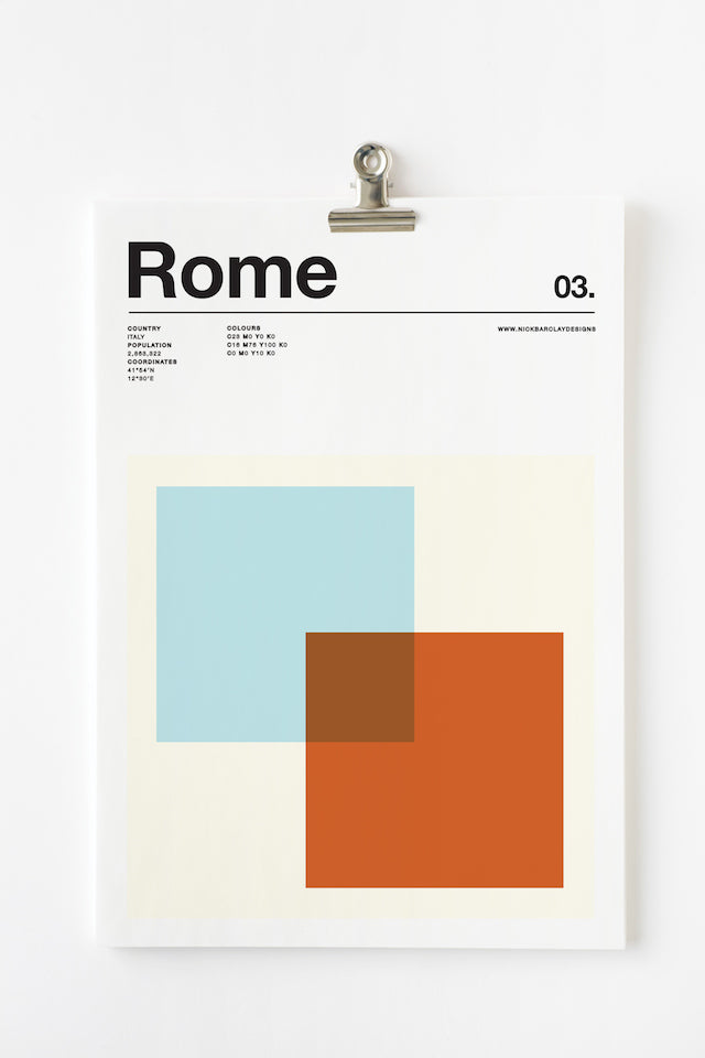
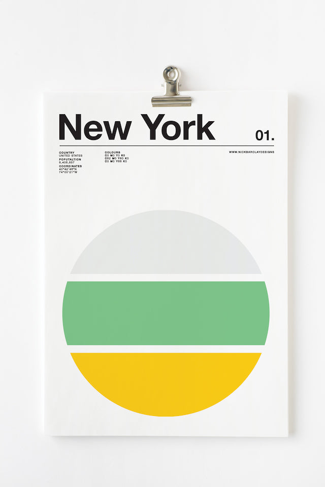
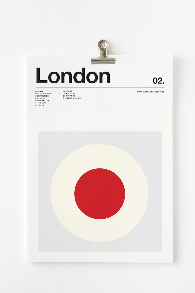
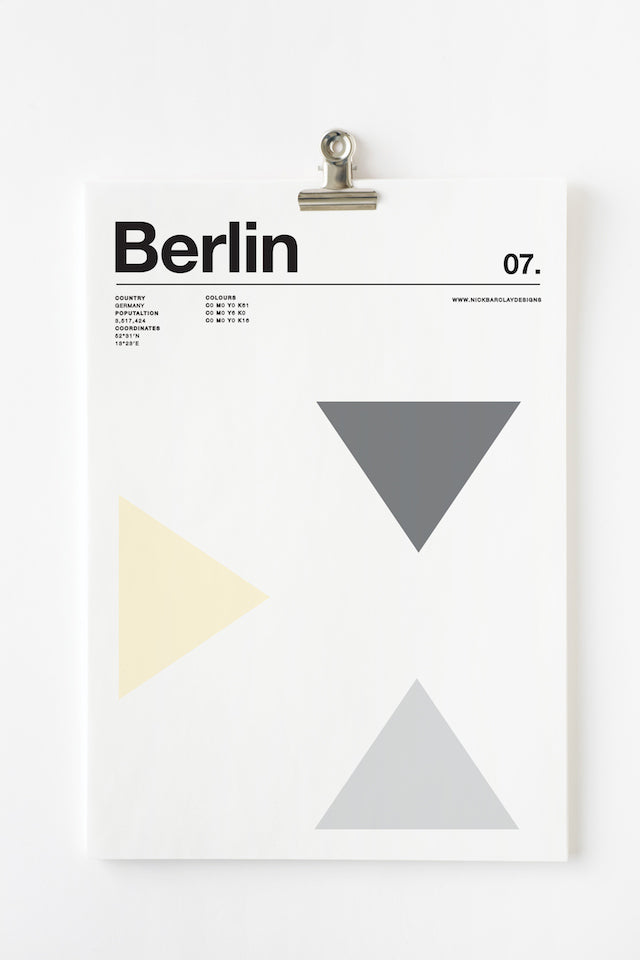
Graphic Designer Nick Barclay has decided to pay tribute to cities and their 3 favorite colors through his minimal poster series 'Three Colors Cities'. For the city of New York, the yellow is reminiscent of the color of the taxis, the green is for the Statue of Liberty and the gray refers to the skyscrapers. On the poster of London, we find the red buses and phone booths. You get the idea, it's a fantastic and highly stylish use of the Swiss design style. The approach is something worth bookmarking if you need some killer typography examples.
Leave a comment
Comments will be approved before showing up.




Andrew Smith
Author
I am a Creative Director living and working in New Zealand, I have a special interest in travel and landscape photography, I also produce presets for Adobe Lightroom.