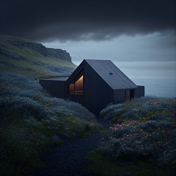
Modern Architecture | Cabin Inspiration
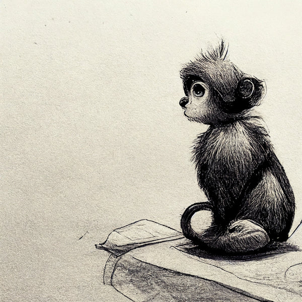
Drawing Ideas
Graphic Design Inspiration
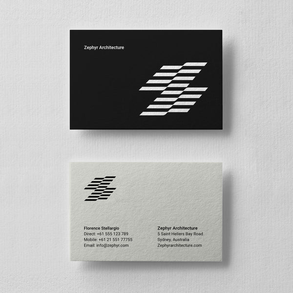
Business Card Design Ideas | By Abukoo
A new range of business card designs are now available at abukoo.com. The Adobe Indesign templates come with free fonts and are a mixture of styles - minimalist, quirky and typographic.
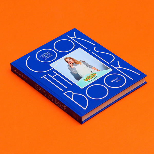
Font & Typography Design | Graphic Art by VJ Type
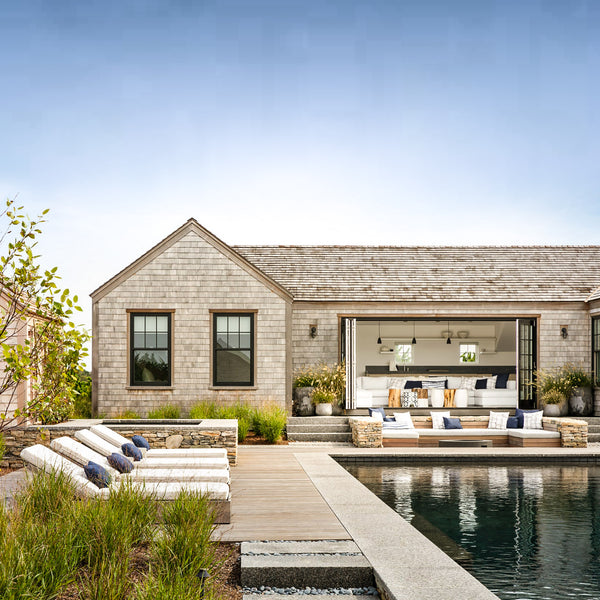
House Design | Modern Exterior
Designing a new house can be challenging, big decisions like the exterior cladding is one you don't want to get wrong. This choice impacts the overall visual appearance (yep you'll be looking at it everyday), the homes long term durability, level of insulation and importantly how it fits with the surrounding environment.
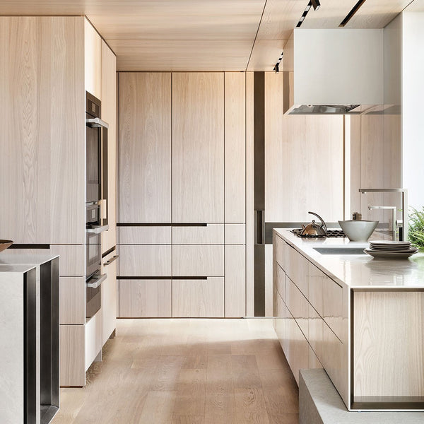
Kitchen ideas | Design by Workshop APD
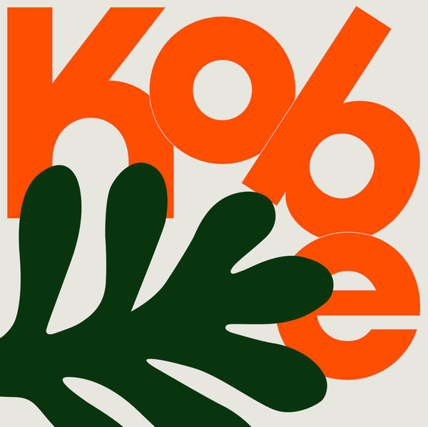
Fonts by VJ Type
New Branding Design | Kia
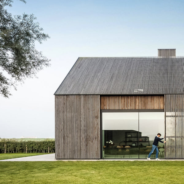
Modern Farmhouse | The Bunkers
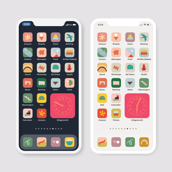
iOS 14 Home Screen Ideas
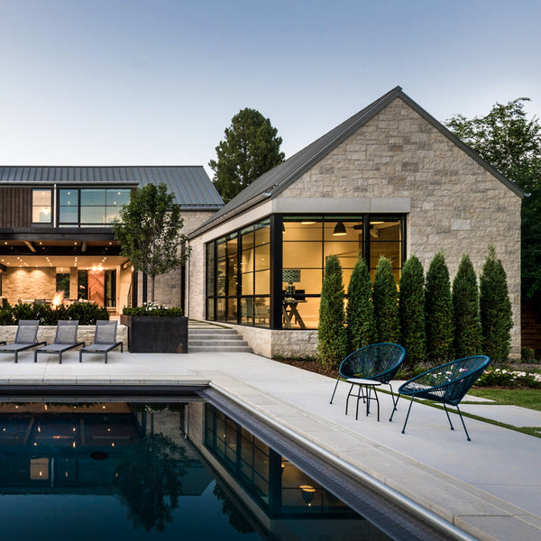
Modern Farmhouse | By Surround Architecture

Minimalist Poster Design | By Genís Carreras
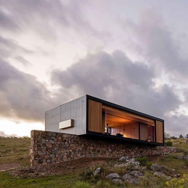
Prefab Homes | By MAPA
MAPA are an architectural studio with offices in Brazil and Uruguay. They create compact beautifully designed prefab homes. This compact house was prefabricated in a factory near the Uruguayan capital, before then transported 200 kilometres by truck to a picturesque olive grove surrounded by rolling hills.
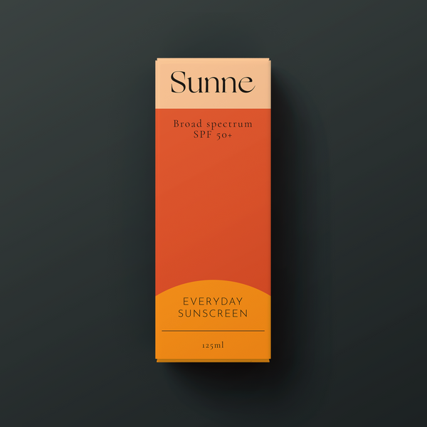
Website Design & Branding for Sunne
Sunne is a self-initiated brief by Australian freelance graphic designer Marika Pathe. Sunne is a luxury suncare brand that seeks to elevate the sunscreen experience—making it a vital and an anticipated part of women’s skincare and self-care routines.
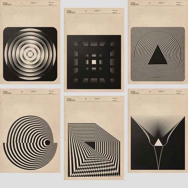
Geometric Graphic Design | By Faith Hardel
Fatih Hardal is a Graphic Designer, Typographer and Researcher. He graduated from Marmara University Faculty of Fine Arts in 2019. During that same year he founded Hardal Studio.
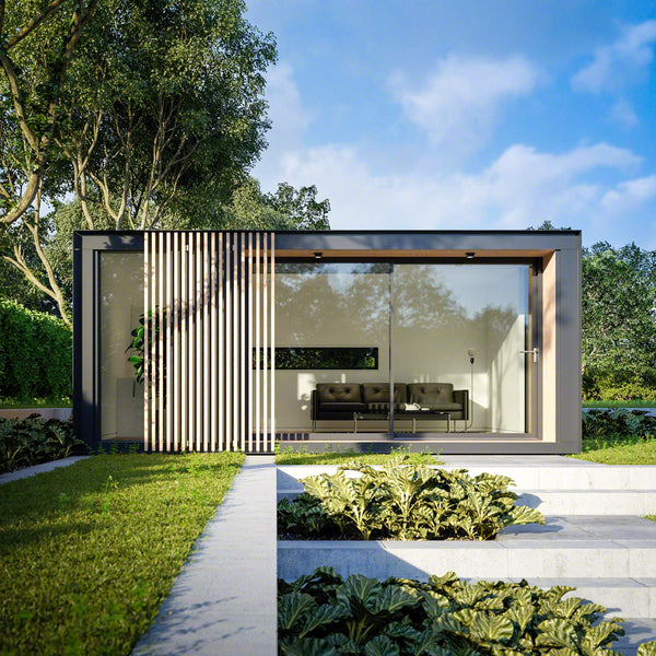
Home Office | Design by Pod Space
With much of the world in lockdown, Covid has sent millions of people home to work. Corporate offices, and CBD's are eerily quite with the metro hum being pushed in the suburbs. Our homes have become a new sanctuary from the world, and working at home has become the new norm.
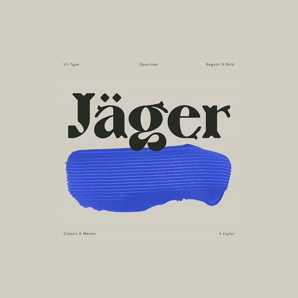
Typography Design | Jäger by VJ Type
Jäger, is a highly crafted new typeface from Violaine & Jérémy It's now available is two two weights, bold and regular - plus a bunch of amazing ligatures. Jäger is described as a tribute to fine craftsmanship. The typeface is directly influenced by traditional techniques mastered by craftsmen.
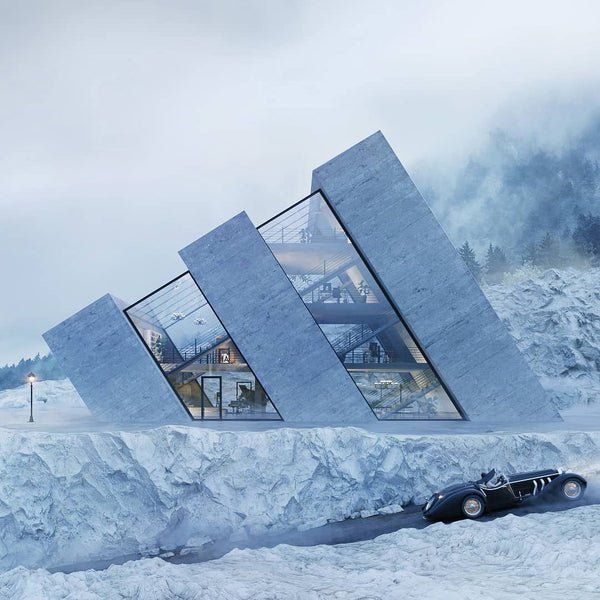
House design inspired by logos | By Wamhouse
Wamhouse is a Polish architecture, interior and furniture design company. Recently they undertook an extraordinary creative project to design buildings based on company logos.
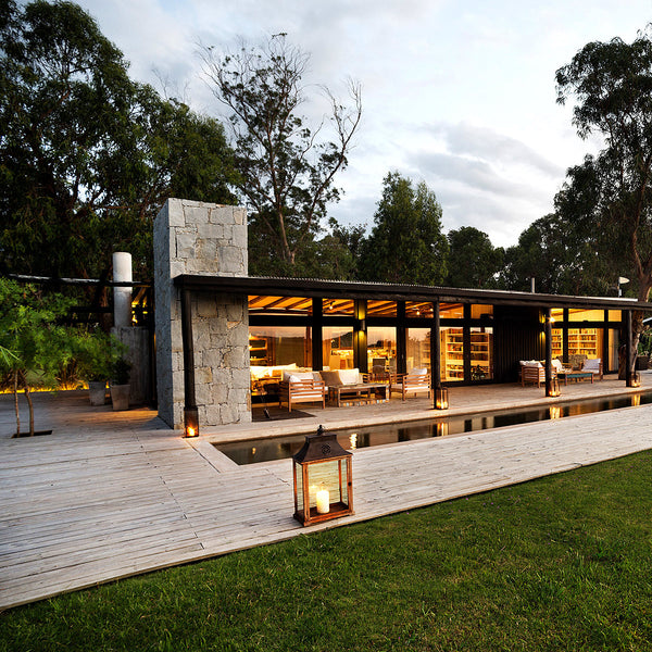
Modern House design | By Martin Gomez
This New Zealand inspired house is located in José Ignacio Uruguay, but would feel right at home in the New Zealand countryside. Architect Martin Gomez was highly influenced from his time spent traveling the world - in particular the months spend in New Zealand. He describes the 'kiwi' style as something that transfers well into his local landscape, as does the use of timber. "We love working with wood," says Martin, whether natural or stained black. "Black is the best colour to go between the trees and the green farmland."
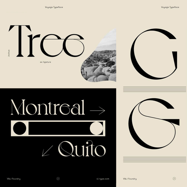
New Font & Typography Design | By VJ Type
As many of you will know I've been a huge fan of the typography and font design of Violaine & Jérémy. I follow their work with a sense of excitement because whenever they release something new it's usually amazing. The new typeface Voyage is no exception, it's bespoke and highly crafted letterforms will grace any project, I hope you enjoy discovering it as much as I did. You can test drive and buy the font from the link below - make sure you support their work as there's not many designers who can deliver what these two do.
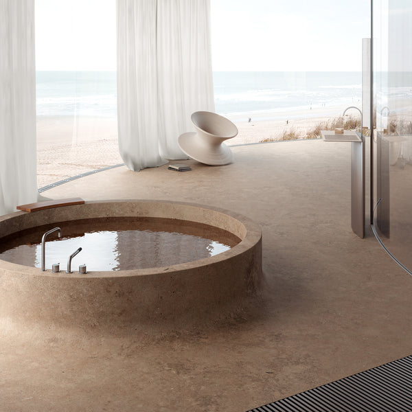
Home decor ideas | Sivak Partners
Sivak Partners are an award-winning team of architects and designers working in Ukraine and worldwide. They produce beautiful, minimal and highly crafted design solutions for their clients. They work with private and corporate clients, designing bathrooms, houses, apartments, offices, cafes, restaurants, hotels and more. These incredible bathroom and hotel room designs were for a recent beach hotel in Odessa, Ukraine. Truly incredible work.
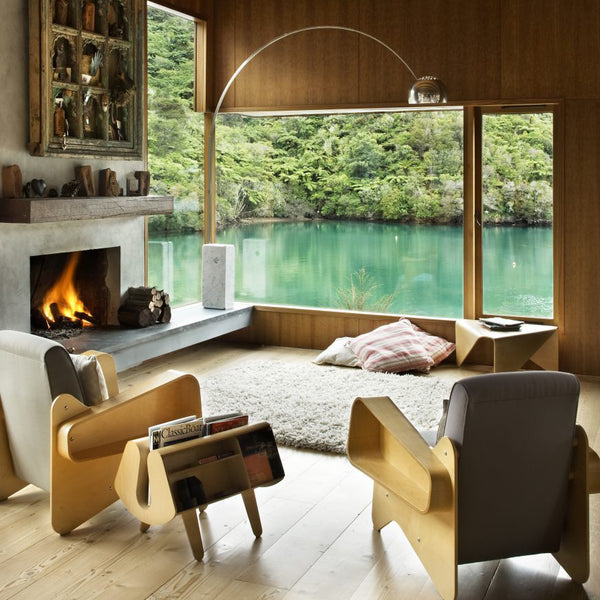
Mid Century Modern | Waterfall Bay House
The Waterfall Bay house was designed by Bossley Architects is located in a remote bay in the Marlborough Sounds, New Zealand. This stunning mid century inspired house emphasises the intimate qualities of the small bay. It's set close to the water it runs along the contour as a two storey primary element incorporating living areas above and guest rooms below - the main bedroom is linked by a glazed bridge.
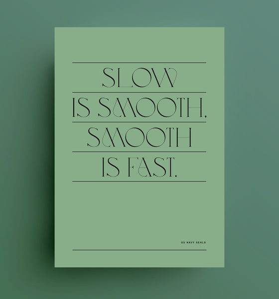
Typography Quotes
Recently I started exploring some new typography layouts and bespoke fonts from VJ Type. I thought visualising some of the motivational quotes I've been collecting looked like a good place to begin. I've done a few variants below and will add more as I find them.
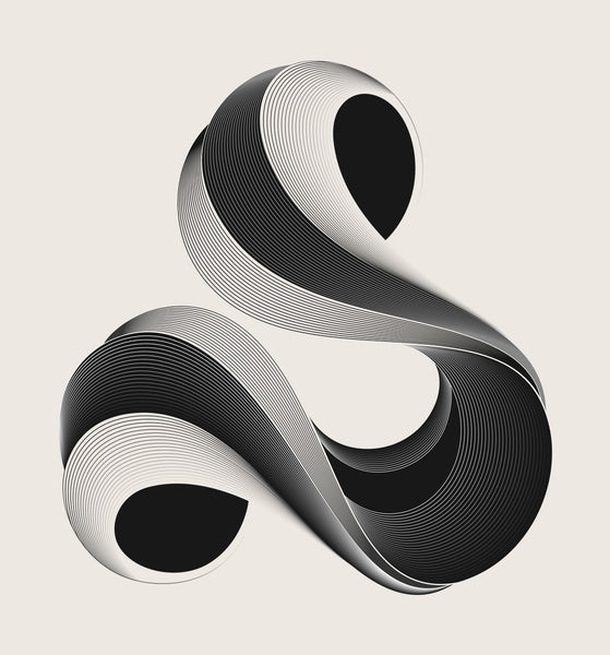
Typography Alphabet
Anthony James is a typographer and graphic designer based in the UK. He recently released this project called Alphabetica. The project uses graphic illustration to bring letter forms to life. The playfully constructed letterforms turn each piece into a stand alone art form that would grace any gallery. Take a look at more of his work on Behance.
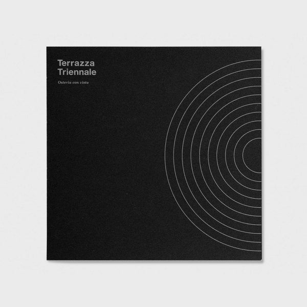
Minimal Graphic Design
Artiva Design is a multi-discipline graphic design studio based in Genoa, Italy. They specialise in producing high impact minimalist branding and visual design communication. The studio was founded in 2003 by Daniele De Batté and Davide Sossi. Their distinctive style has a strong typographic and geometric aesthetic. It often leans toward pure black and white as a core colour palette. The spectacular volume and quality of work is defined by its rigorous use of the grid system. This is coupled with strong contrasting line weights and graphic pattern work.
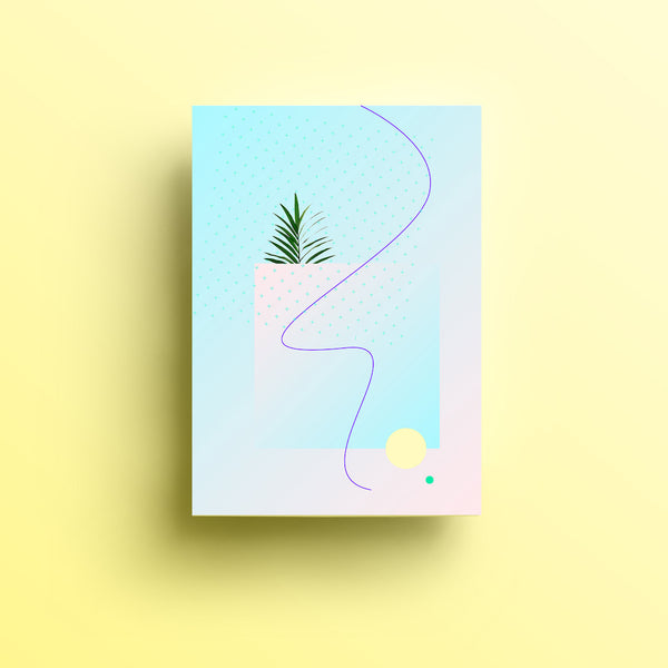
Geometric Poster Design
Isabella Conticello is graphic designer and illustrator in Milan. Her highly graphic work spans both editorial and brand identity design. Her work is bright, simple and colourful, it’s characterised by her love of geometric minimalism and abstract pattern work. She has a stunning range of work, to see more of it check out her Behance profile - and if you have a project is also available for commissioned work.
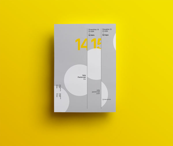
Poster Design Ideas
Quim Marin is a graphic designer and art director based in Spain. He creates highly graphic eye catching posters that manage to cut through even in the busiest environments.
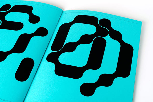
Creative Typography Design
Formist is a graphic design studio, a publisher and a type foundry. Formist utilise their unique design and typography experience to develop a variety of bespoke solutions for both self-initiated and commercial projects. Formist has vast experience working with industry leaders specialising in design for some of the world’s most exciting cultural and commercial organisations.
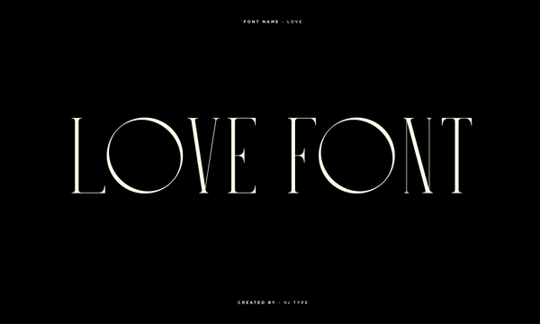
Typography Design Ideas
For a while I've been wanting to showcase the full alphabet set of the new Love typeface. As mentioned in a previous post the font was designed in 2018 in Paris by Jérémy Schneider - the typeface is a beautiful blend of contrasting elements, characterised by its big counter-forms and thin stems. Take a look at all the font forms below, both light and dark backgrounds have been included. Perhaps some of the most exciting parts exist in the special characters, the '@' symbol and '&' are superb and worth checking out.
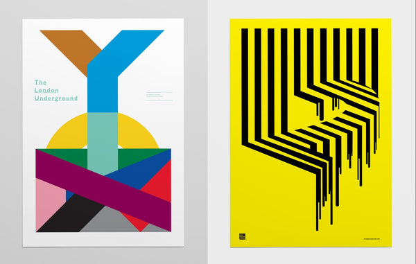
Geometric Poster Design
Sydney based designer Nick Barclay has carved out a named for himself by creating beautiful graphic poster designs. His approach is typically minimal, with a strong Swiss styled design aesthetic. The inspirational work provides vast typographic inspiration and his conceptual ability allows him to interprets different topics and messages in a graphically dynamic way.
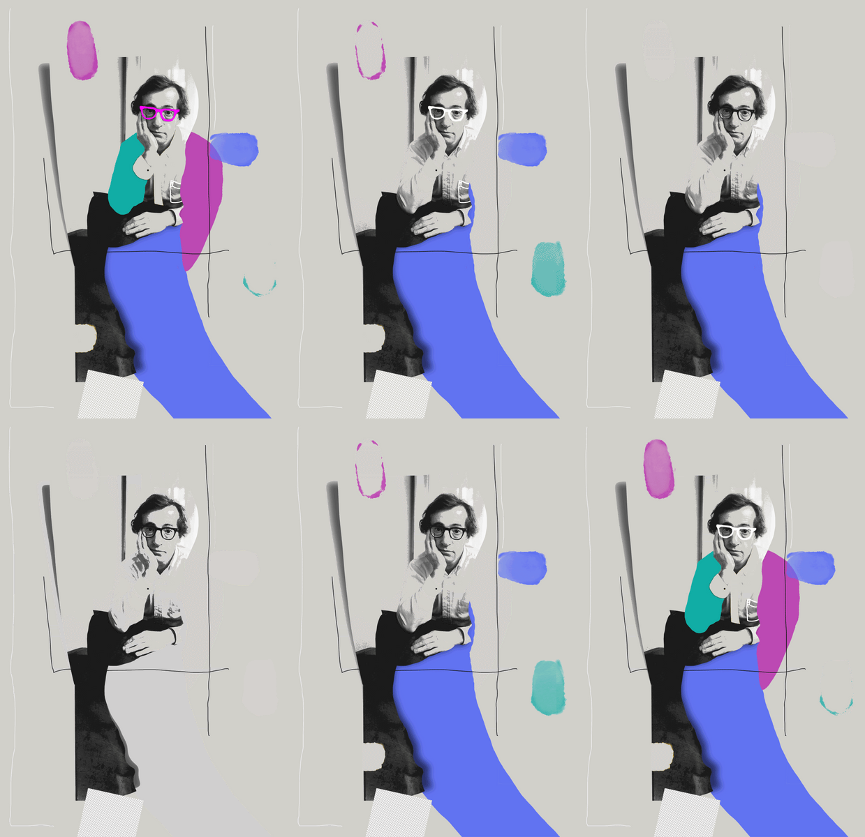
Poster Art Illustration
Midnight in Woody’s color is a self directed poster project by visual artist Selman Hosgor.
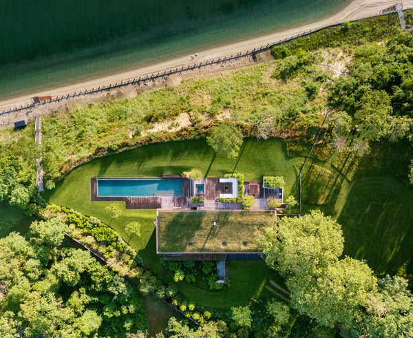
Modern Beach Home
New York Architecture firm Mapos Studio have designed this stunning grass-topped holiday home in the lush hills overlooking a Long Island bay. It's covering in untreated wood, steel and concrete to match the surroundings. The result is a striking, modern and beautiful beach front home.
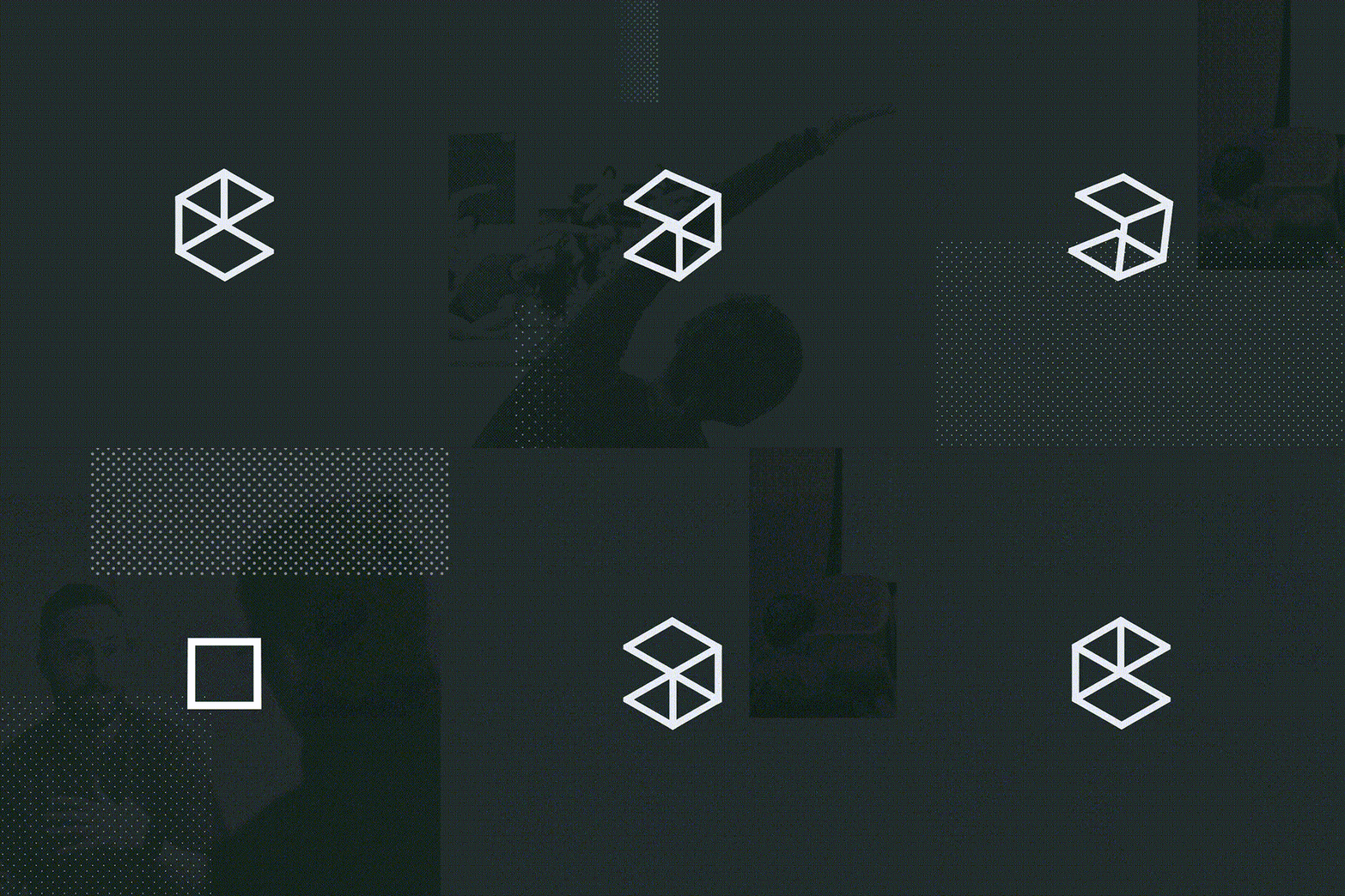
Brand Identity Design for Google Campus
MultiAdaptor is the design studio behind Google's Campus brand identity. The rebrand was positioned slightly away from the main Google brand and serves the special network of google funded start-ups. The design helps capture the energy and excitement of start-up culture, and supports the spirit and energy of the entrepreneurs, founders, employees and investors that make up the Campus network.
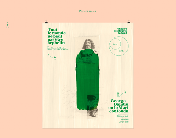
Mixing Graphic Design & Illustration
Graphic design duo Jérémy Schneider and Violaine Orsoni run a multidisciplinary creative studio in France that focuses on typography, illustration and editorial design.
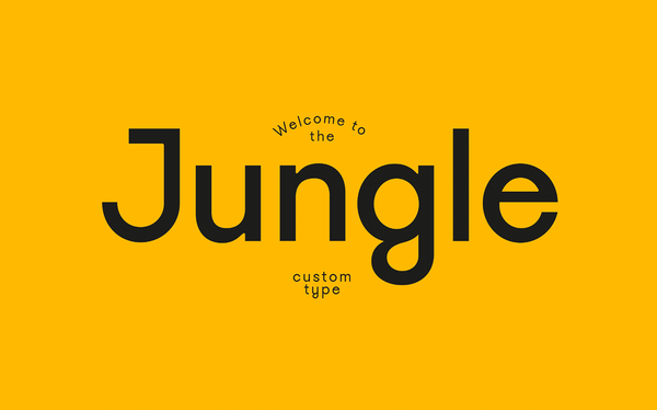
Typography Design
VJ Type recently created this fantastic new custom font for Welcome to the Jungle magazine. The typeface has 4 weights and italics. The stylised upper letter forms have a number of clever customised curves. This create some truly bespoke personality, just take a lot at the editorial layout designs below.
