Font & Typography Design | By VJ Type Foundry
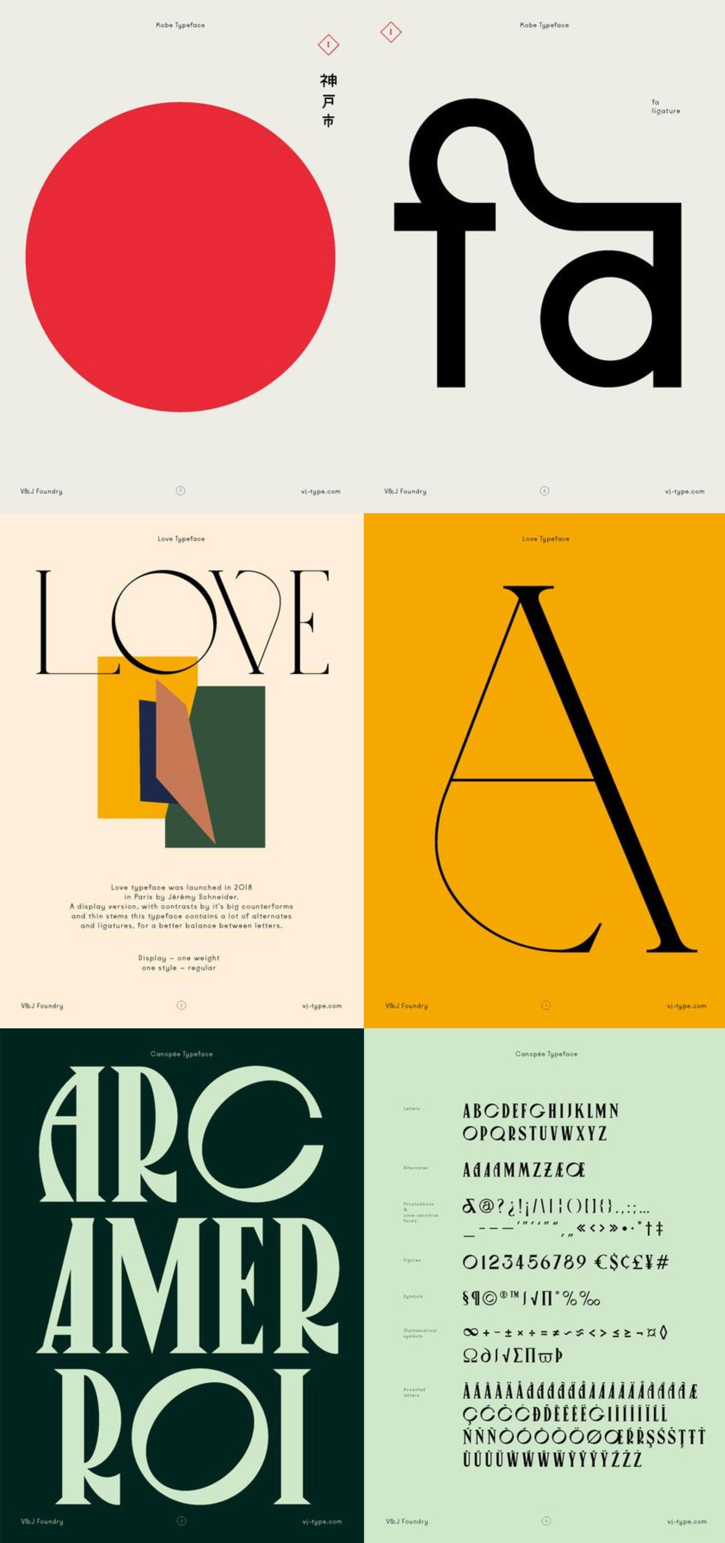
The Violaine & Jérémy studio recently launched a fantastic new font offer - the VJ-Type foundry. Violaine & Jérémy specialise in design, typography and font creation, and recently committed to started a bespoke type foundry. Many of the fonts now available for license are custom fonts they produced for commercial projects already delivered. Many designers will now be excited to hear those bespoke fonts are now available for license. As designers their passion is clearly evident, approaching each design with their own artistic style and sensibility. They focus on creating strong and distinctive fonts, that help produce highly memorable results. Their work is perfect if you need something special for new or unique client or looking for some true X factor - the VJ-type foundry is definitely the right place to look. I've included some of the new font sets below as a teaser.
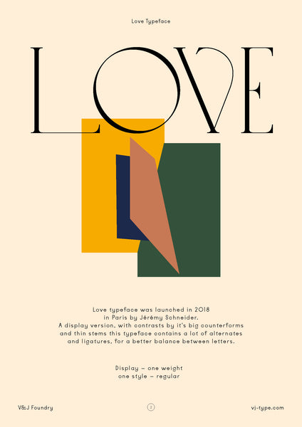
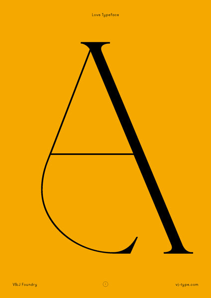
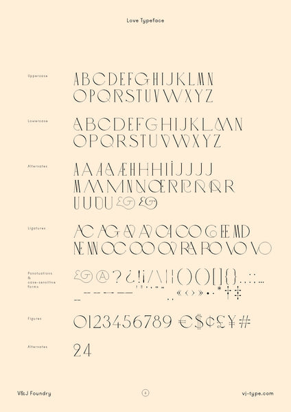
LOVE TYPEFACE
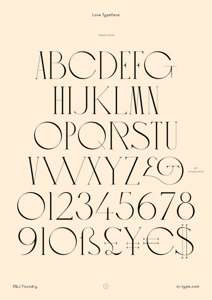
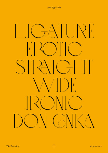
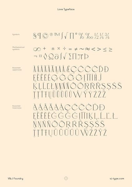
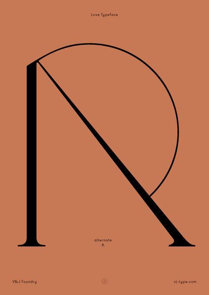
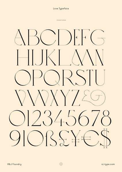
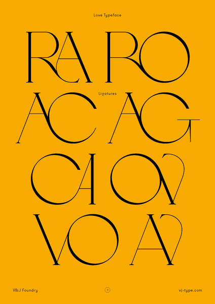
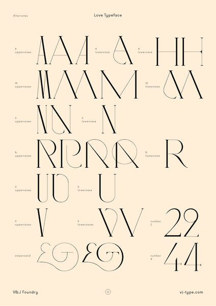
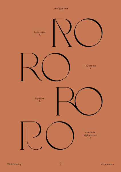
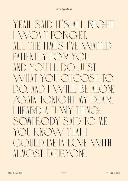
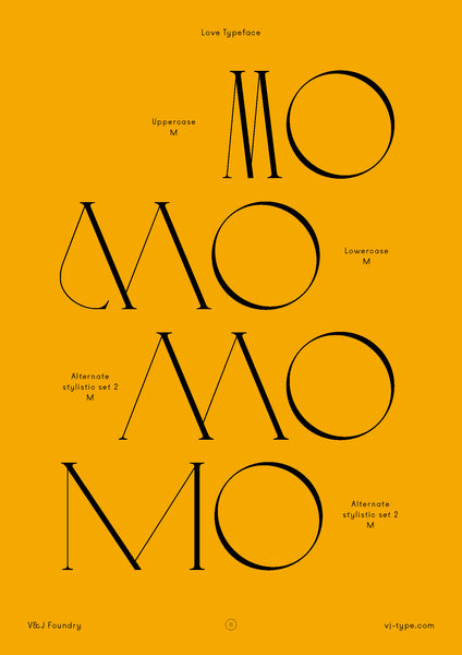
Love typeface was designed in 2018 in Paris by Jérémy Schneider. A display typeface, with beautiful contrasting elements created by its big counter-forms and thin stems.
KOBE TYPEFACE
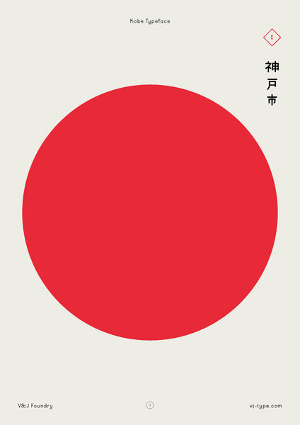
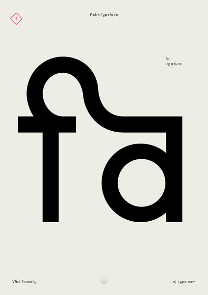
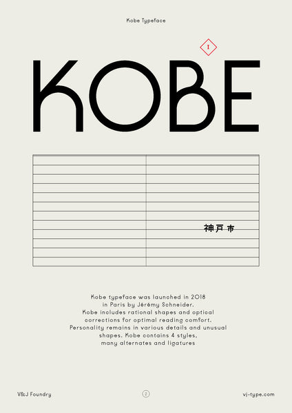
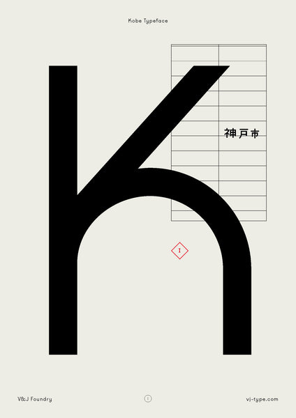
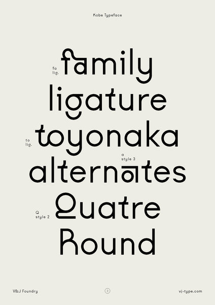
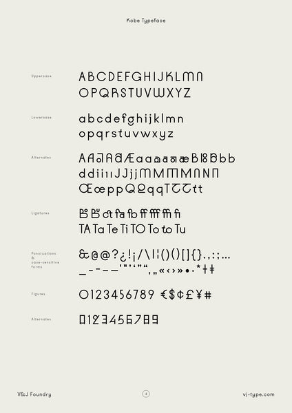
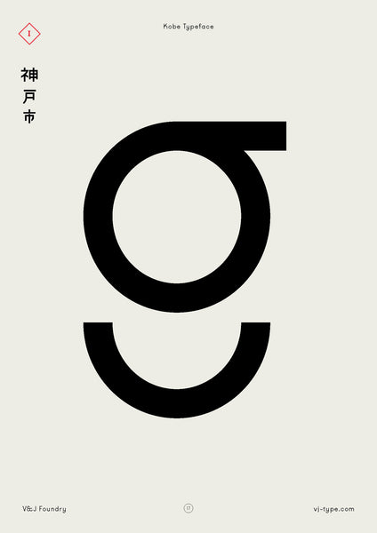
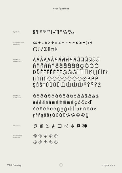
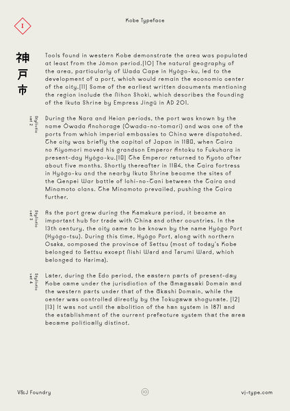
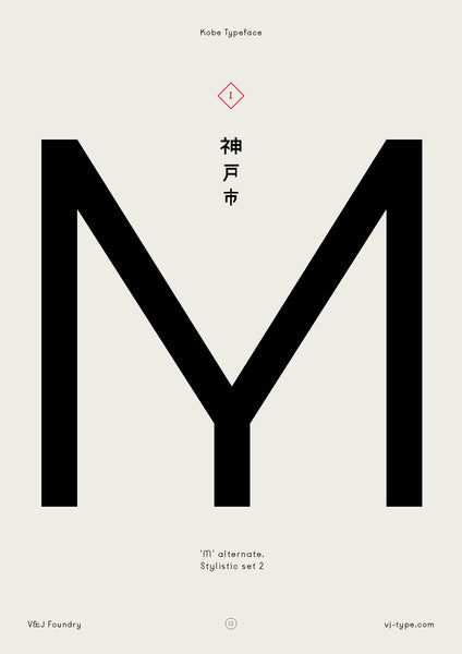
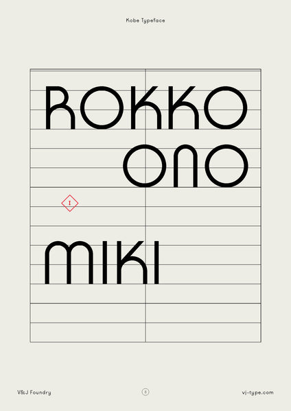
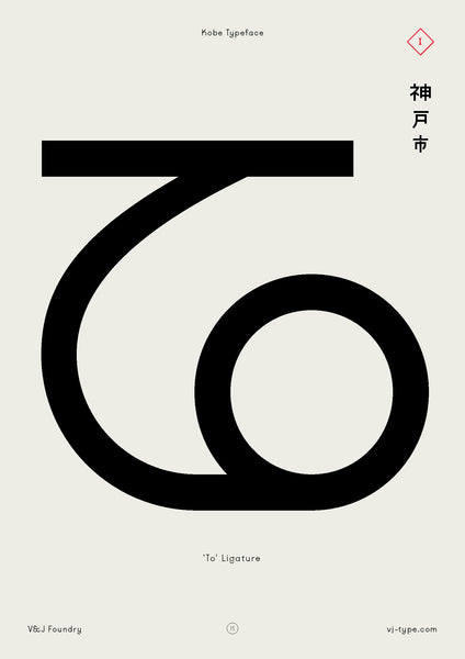
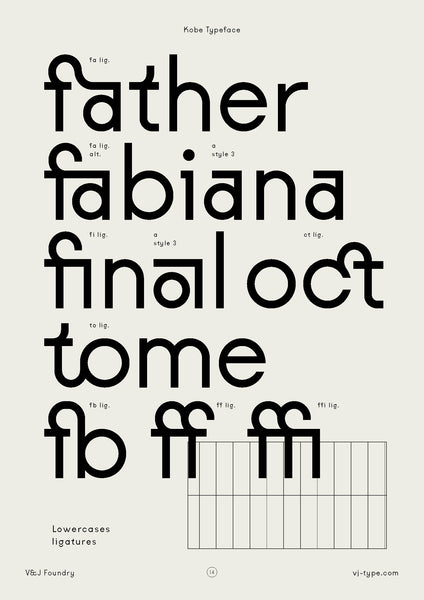
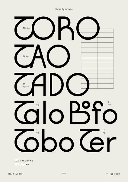
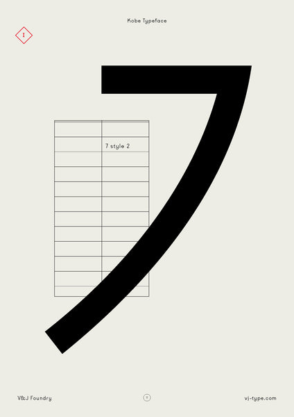
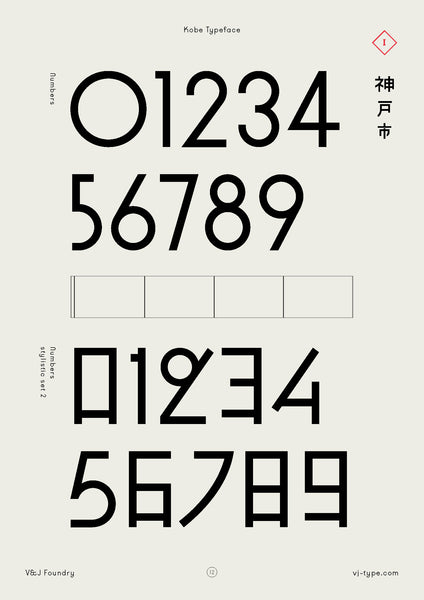
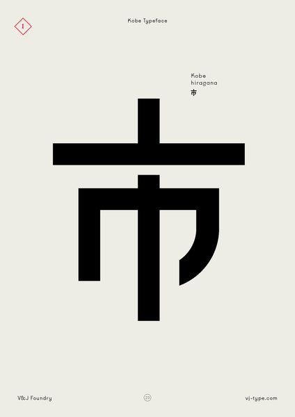
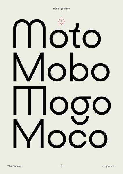
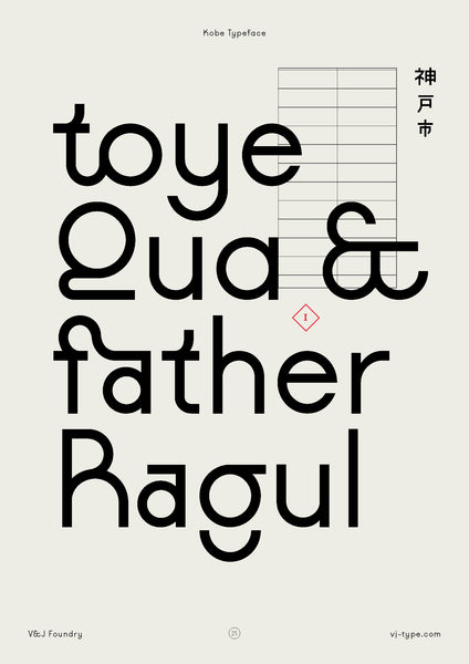
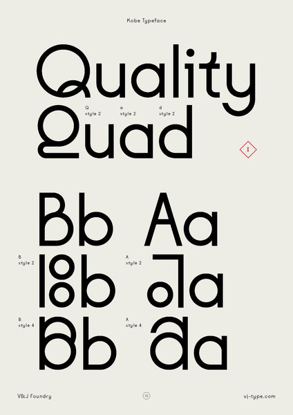
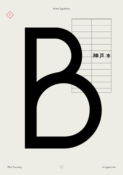
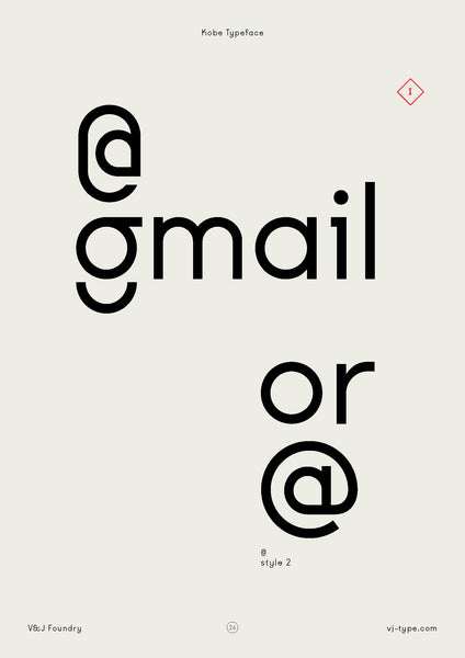
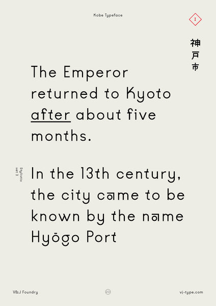
Kobe typeface was designed in 2018 in Paris by Jérémy Schneider. Kobe includes rational shapes and optical corrections for optimal reading comfort. Its identity is expressed in various details and unusual shapes.

DIDA TYPEFACE
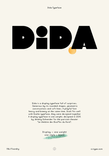
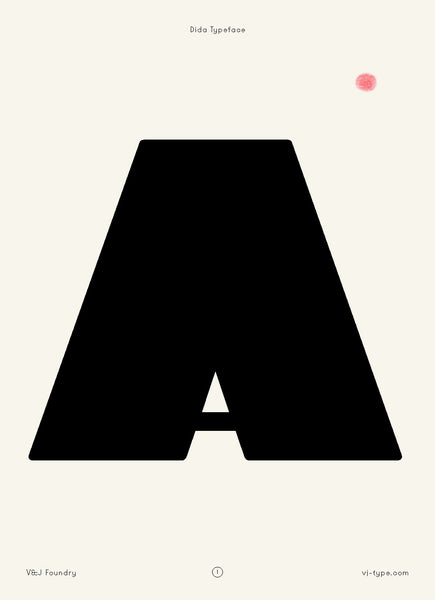
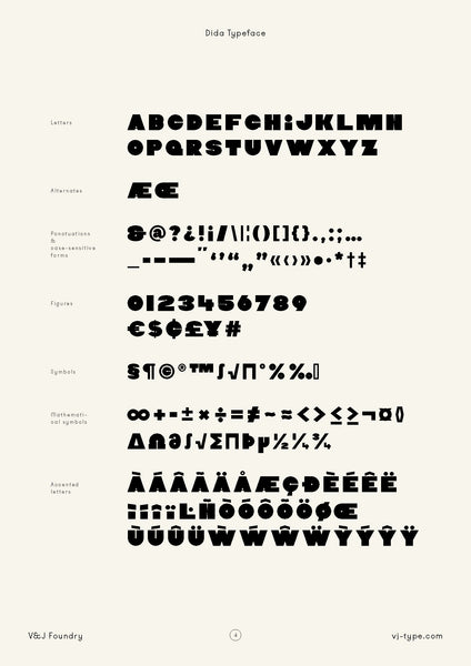
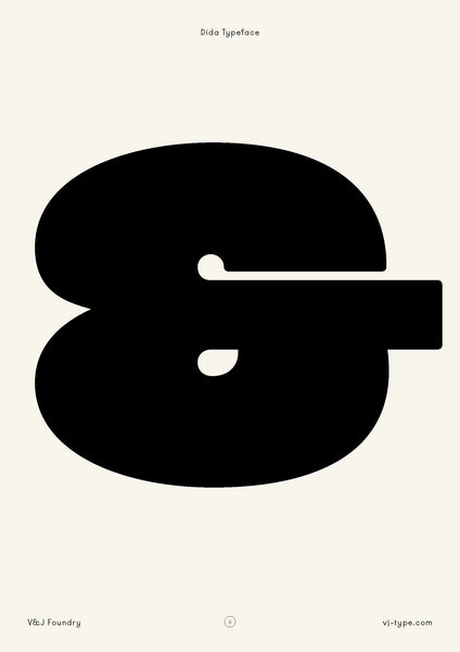
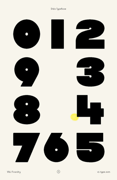
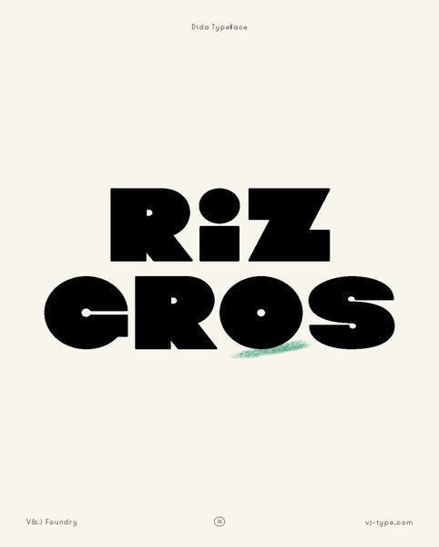
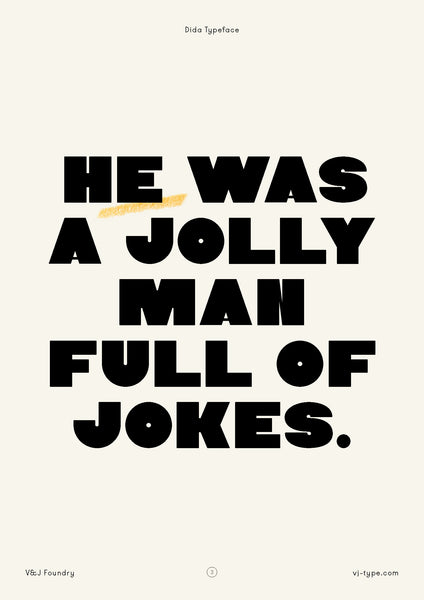
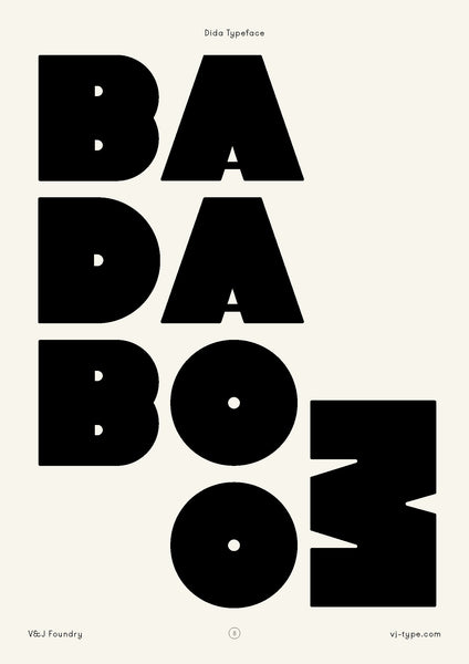
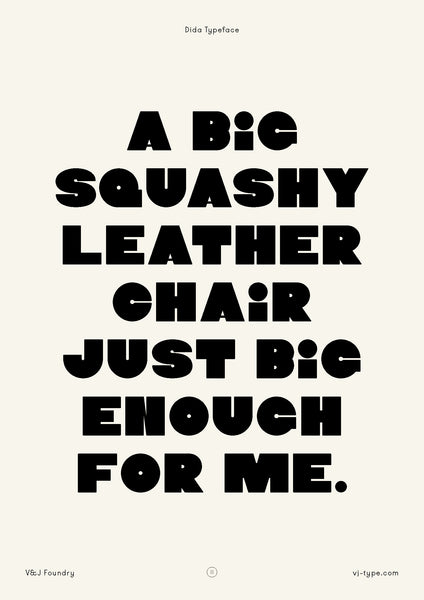
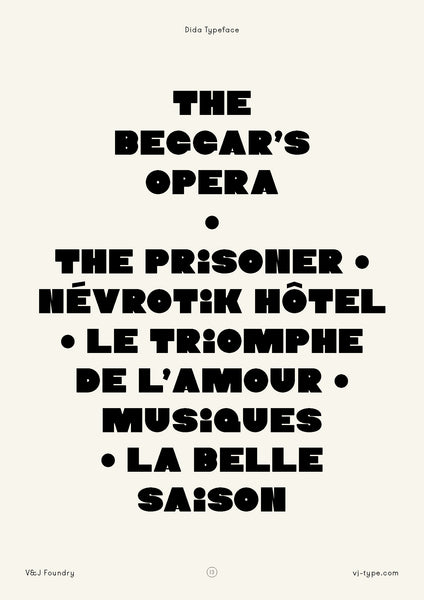
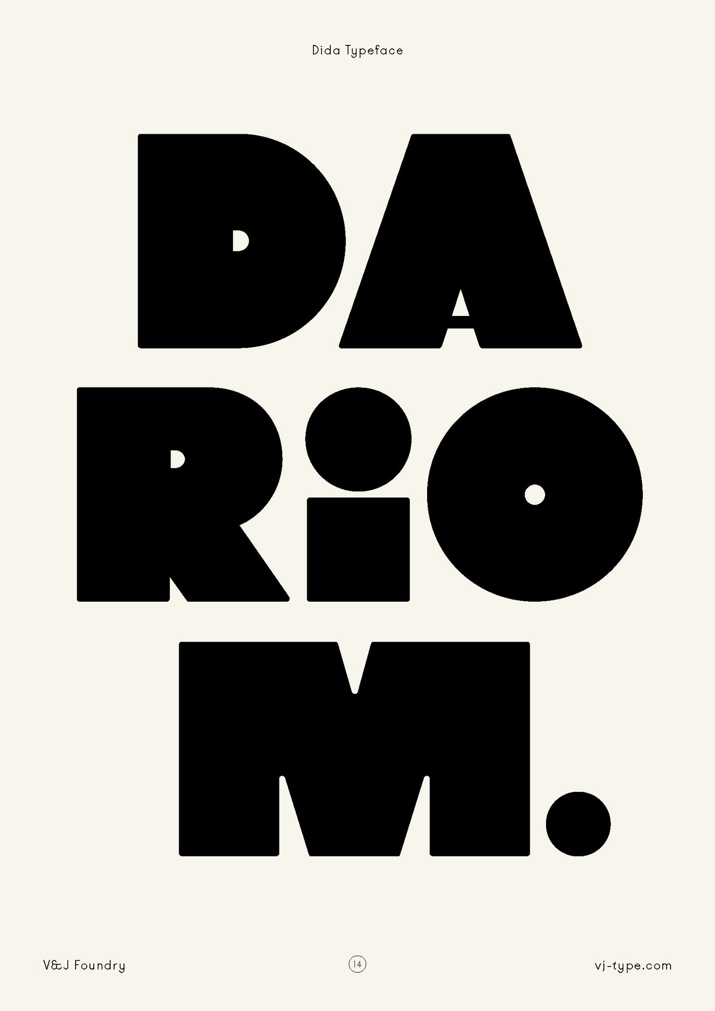
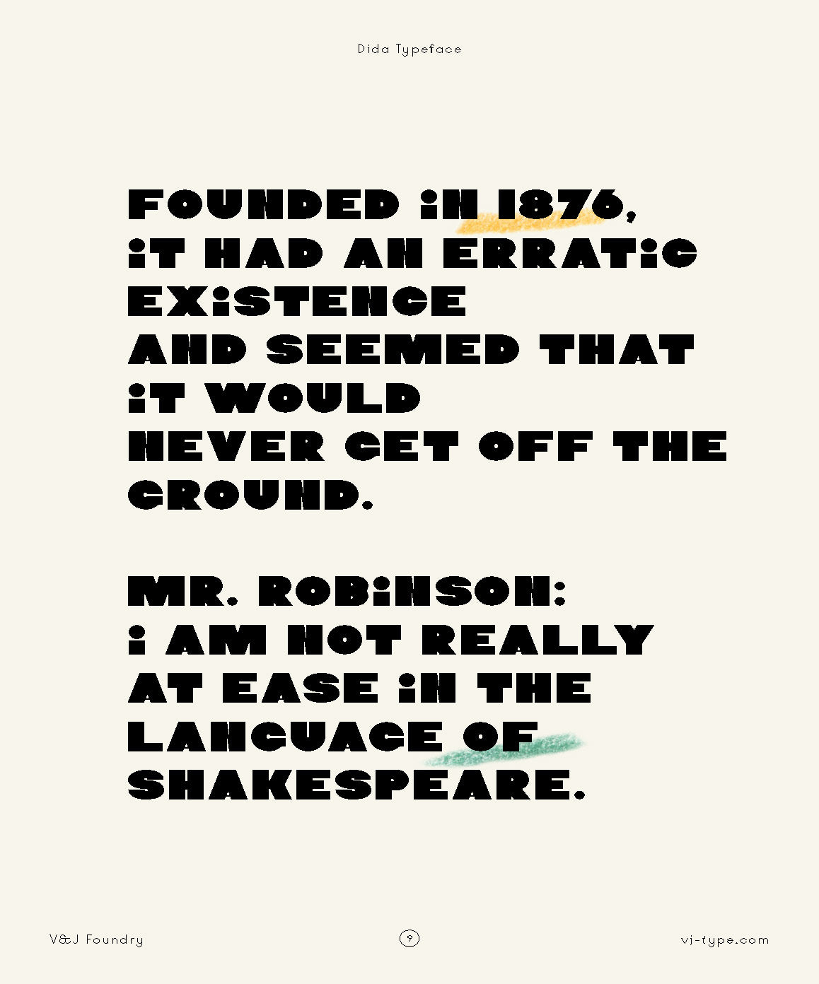
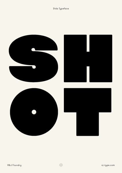
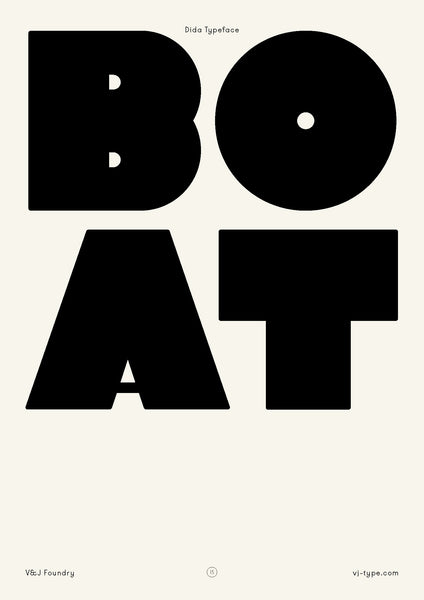
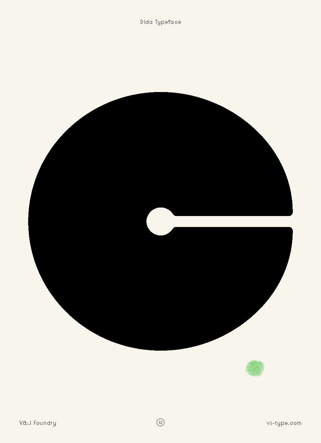
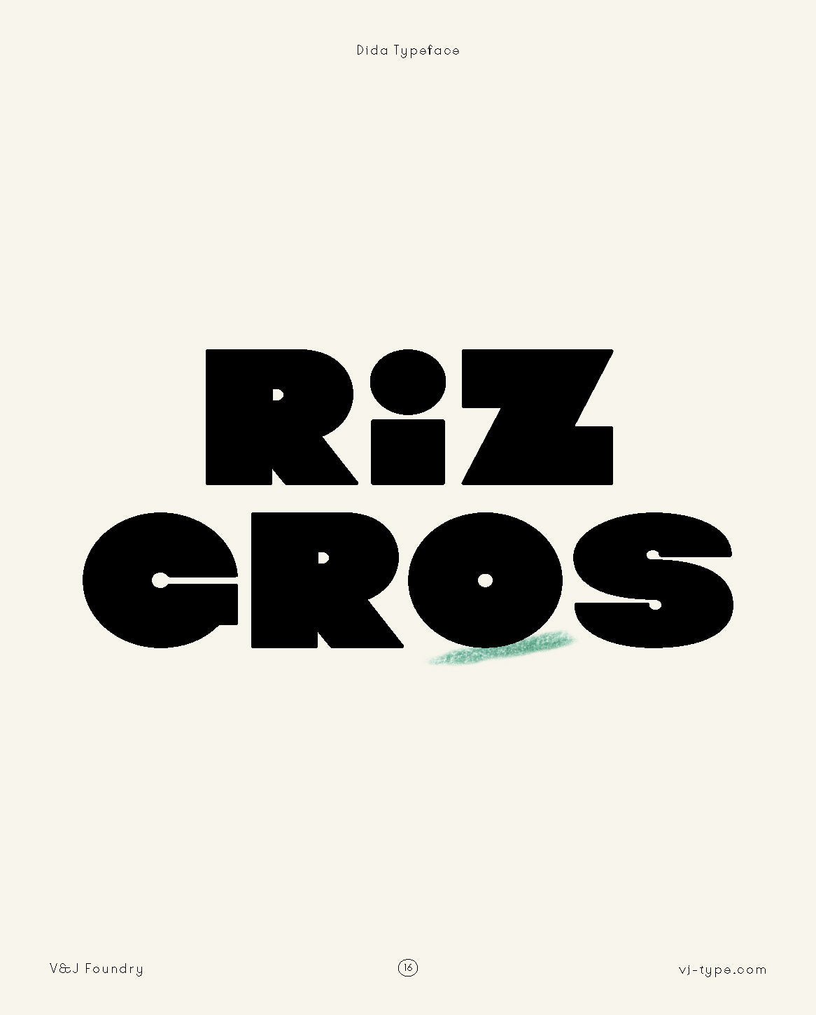
Dida is a display typeface full of surprise. Generous by its rounded shapes, geometric construction and soft lines. It's a playful font, heavy and breezy at the same time. A display typeface in one weight, designed in 2016 by Jérémy Schneider for the Parisian theater “Le Théâtre des Bouffes du Nord”.
NORD TYPEFACE
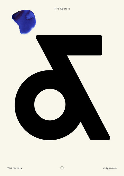
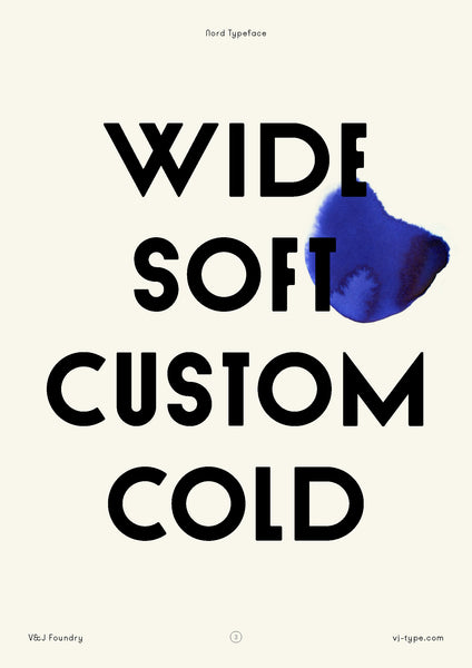
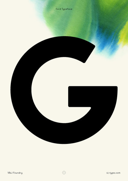
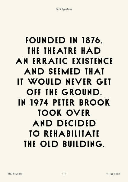
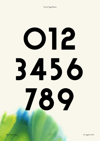
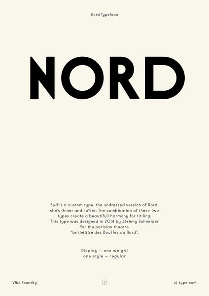
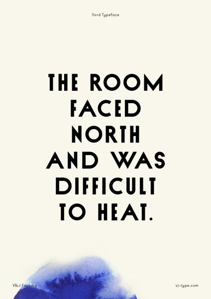
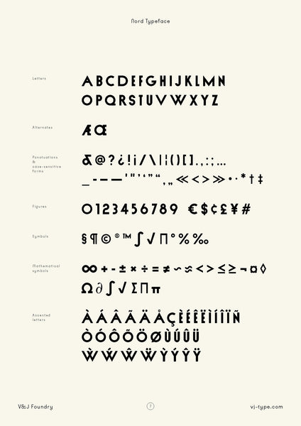
The font is named Nord after "Le Théâtre des Bouffes du Nord". Nord is very bold, its angles are rounded and the base of the letters mixes broad and narrow bases. It has a little sister, the regular version called Sud. The combination of these two types create a beautiful harmony for titling. Nord is a custom typeface created in 2015 by Jérémy Schneider.
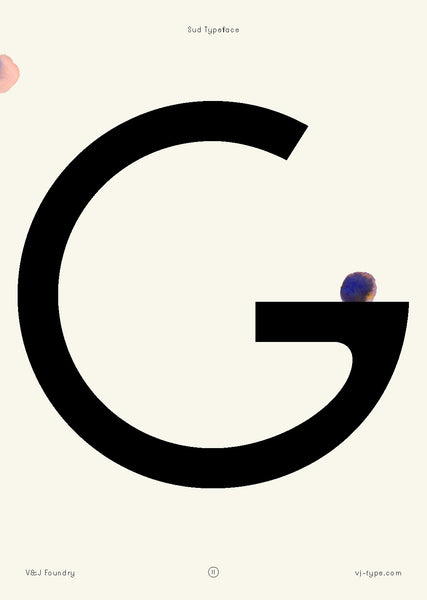
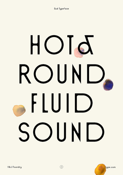
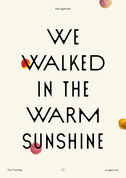
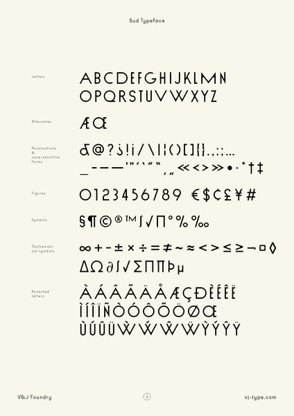
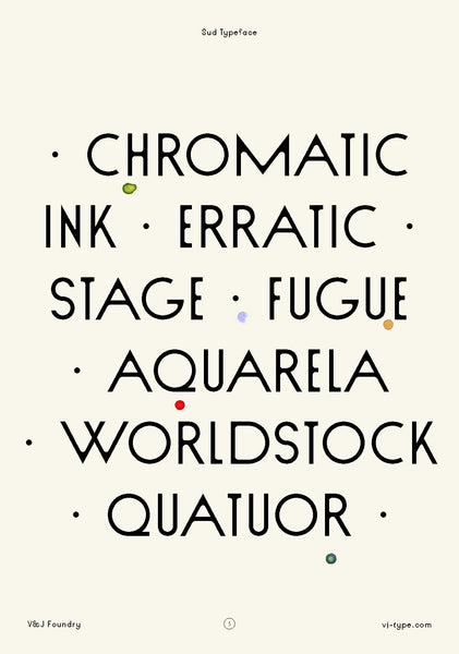
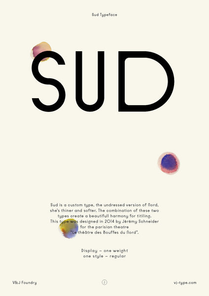
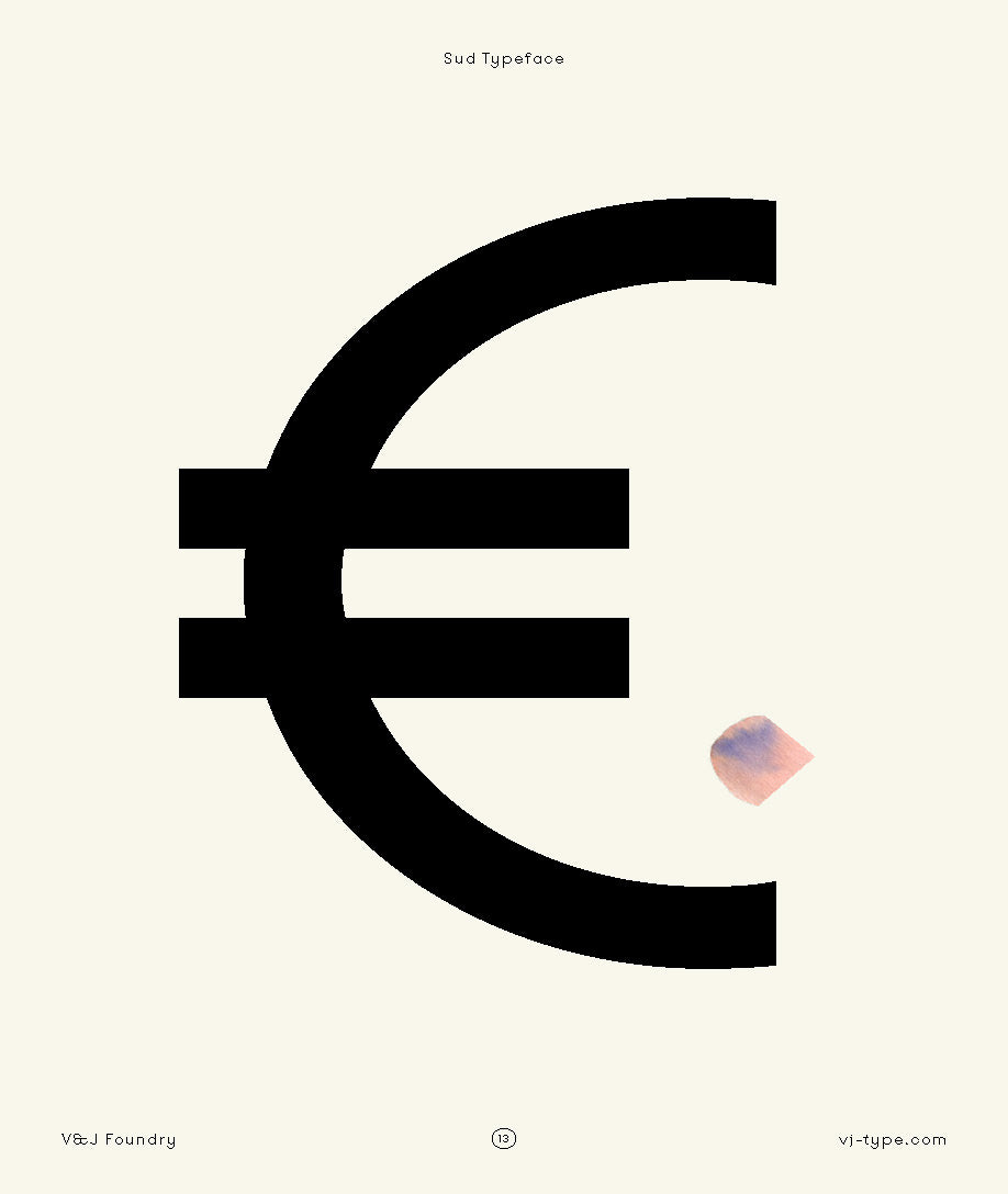
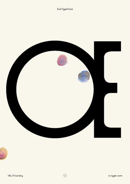
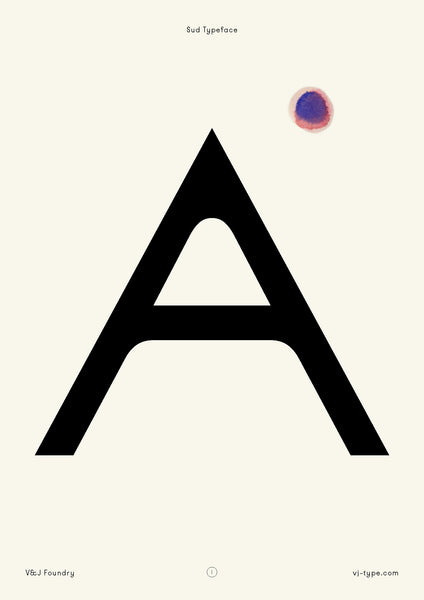
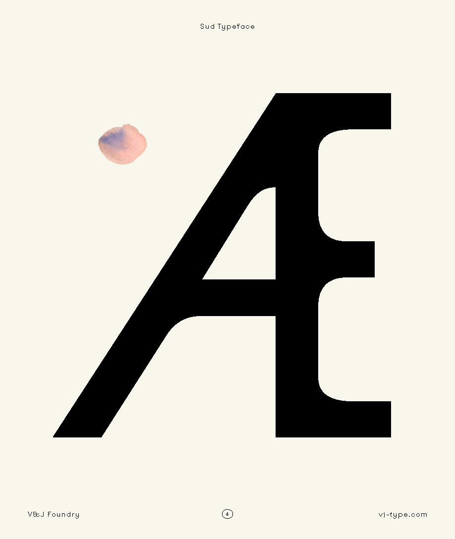
SUD TYPEFACE
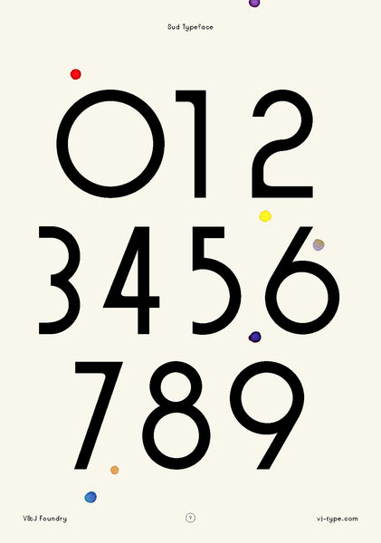
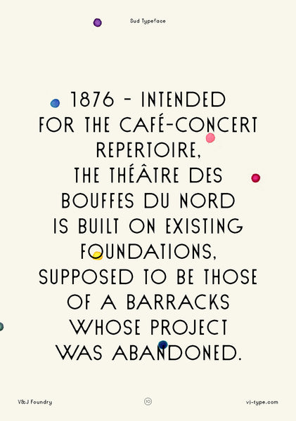
Sud is the undressed version of Nord. She’s thiner and softer. We randomly came to break parts of the letters to bring some irregularities.You can easily combine Nord and Sud. Sud was designed in 2015 by Jérémy Schneider
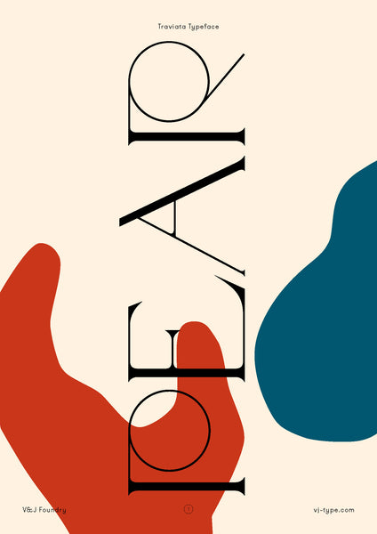
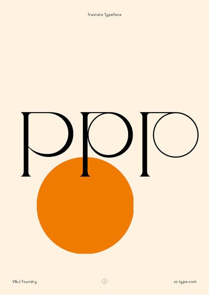
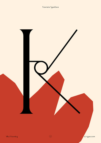
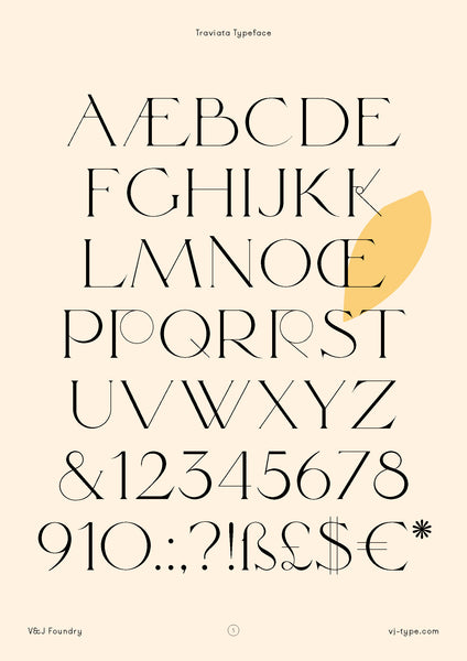
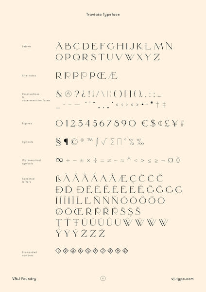
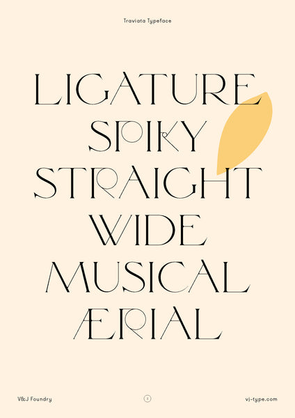
TRAVIATA TYPEFACE
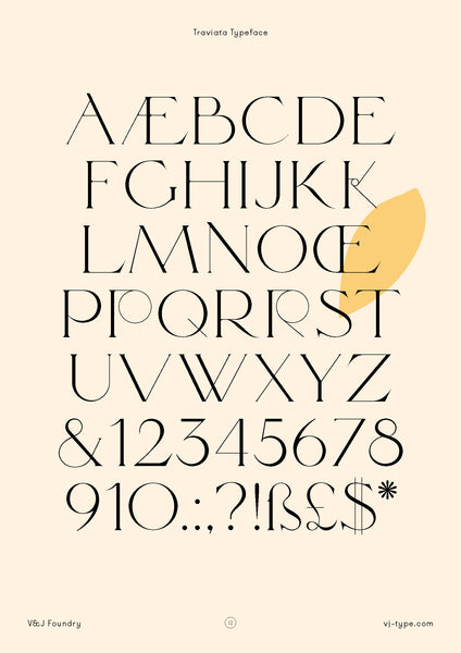
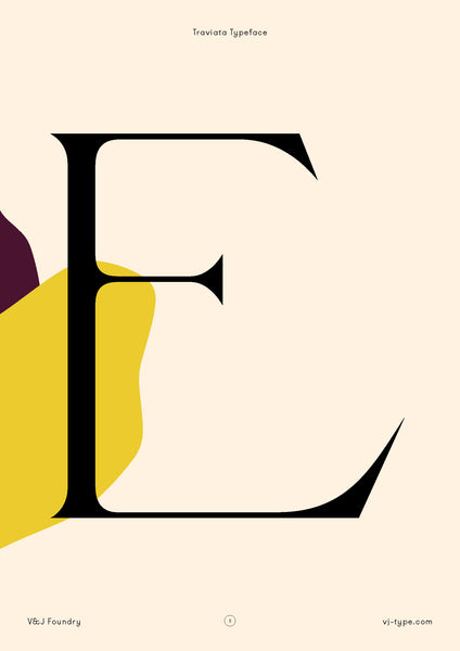
Traviata was launched in 2017 in Paris by Violaine & Jérémy. Traviata is the result of wanting to design a classic, elegant and refined title font with some strong off-beat details.
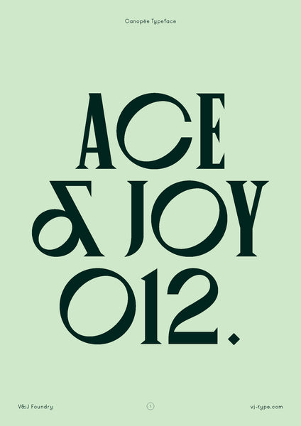
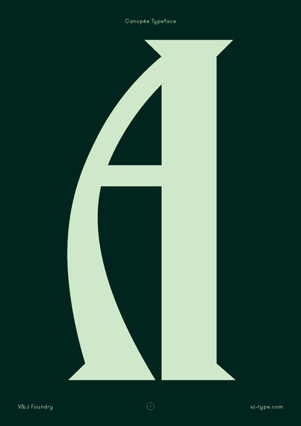
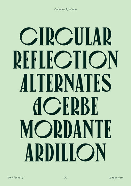
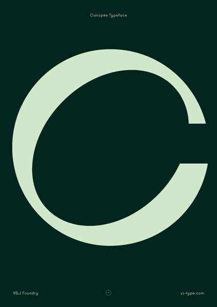
CANOPEE TYPEFACE
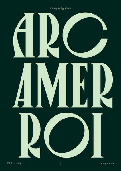
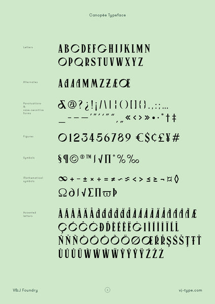
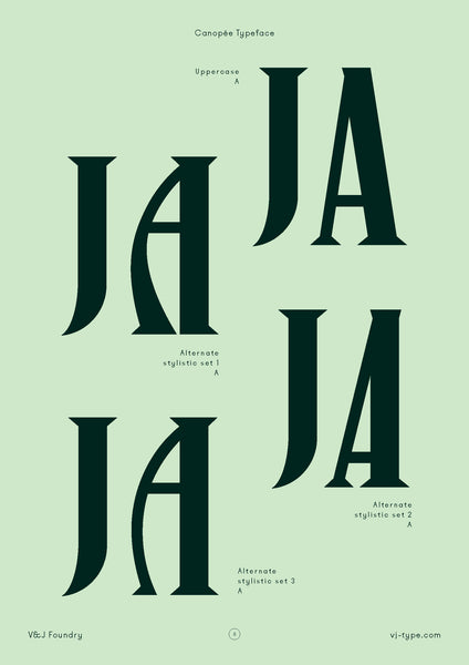
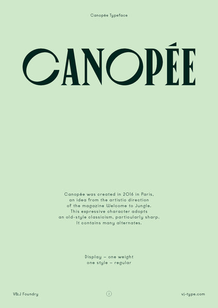
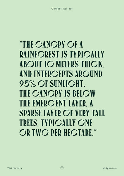
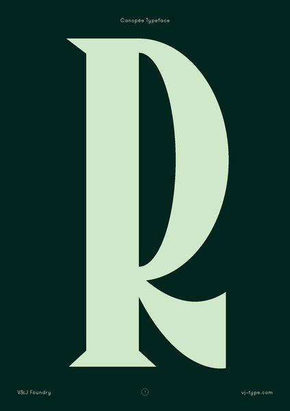
Canopée was created in 2016 by Jérémy Schneider, as part of the artistic direction of the magazine Welcome to the Jungle. This expressive character adopts an old-style classicism mixed with some particularly sharp aspects. The font is supported by many alternates.
1 Response
Gillian
I love the site. I sent you an email around March 27th inquiring about the business cards you featured on your site. I wanted to know how to obtain the template so I could make business cards for myself.
Leave a comment
Comments will be approved before showing up.




Andrew Smith
Author
I am a Creative Director living and working in New Zealand, I have a special interest in travel and landscape photography, I also produce presets for Adobe Lightroom.