Business Cards DIY
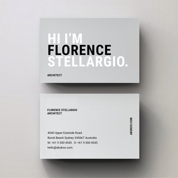
Take a look at this bold new Sans Serif business card template available at Abukoo. The expressive messaging area allows you to craft a more playful introduction when you are meeting prospective new clients or business opportunities.
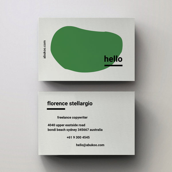
Hello Business Card Design - Adobe Indesign Template
The new 'Hello' series of business card templates are now available on Abukoo. They have an easy to use and quirky style all wrapped up in an editable Indesign template. The template comes packaged with the fonts, with three different abstract 'Hello' designs in green blue and red, you can then edit the greeting to anything you like.
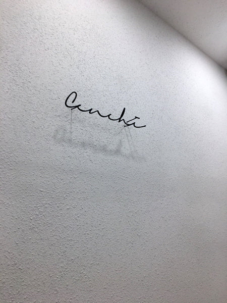
Minimal Signage Design
Incredibly simple signage design for this clothing retailer. I'm not sure where it came from, or who designed it, but it has a beautiful minimal approach to the typography. It's also been expertly manufactured. I'd love to know if anyone can find out where this came from.
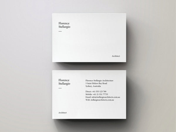
Minimal Business Card - Editable Indesign Template
It’s always important to make the right first impression when you hand over your business card. The last thing you need is to lose opportunities because of your ugly card. This simple, beautiful and minimal design will help do the talking for you. You won’t scare away potential customers or give the wrong impression.
TINTIN Logo Design in Blush and Gold
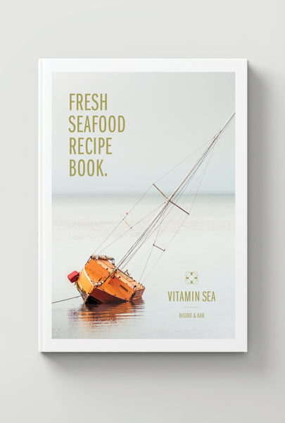
Recipe Book Cover Design For Vitamin Sea
This recipe book cover design for Vitamin Sea really shows off the brands core color palette and sophisticated design aesthetic.
Logo Design for Vitamin Sea Bistro & Bar
Vitamin Sea is a conceptual bar & bistro business. The logo design is suited to a beachside venue with an ocean view. As the name suggests it would lend itself to food with a healthy slant. The graphic styling is a perfect fit for a highend hospitality space, if you'd like to purchase the design and use it on your new venture get in touch.
Logo Design and Business Cards for Fanshaw Rose
Very simple styling on this logo design for Fanshaw Rose. The typography and word mark help support the relaxing tone and vibe of the business. The subtle color palette is maintained throughout the business cards and letterhead helping the concept to lean towards the female demographic.
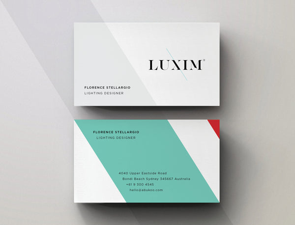
Minimal Business Card Design for LUXIM
I thought a few people would enjoy seeing the minimal business card design for LUXIM. The brand continues express the same stylish aesthetics as the core word mark, but extends the angular graphic elements into the background shapes. The simple clean approach helps elevate the branding into a more sophisticated space, while always keeping the logo as the hero.
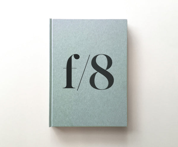
Cover Design | Photography Diary
I love finding and creating beautiful everyday experiences. The cover design of this simple letterpress photography diary is definitely one of those things. It's a perfect place to plan, sketch and record your photo missions. The strong use of typography and graphic design all add to the tactile experience. Simple pleasures are always the best.
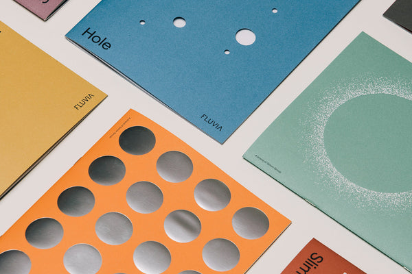
Minimal Cover Designs for Fluvia
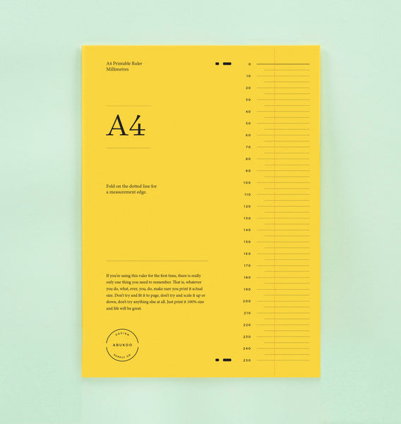
Graphic Design Ideas: Make your own Printable Ruler
This beautiful DIY printable ruler is the perfect measurement solution. It's a simple practical blend of graphic design and numbers. You'll never need to buy another ruler, and best of all, if you lose it you can just print it again.
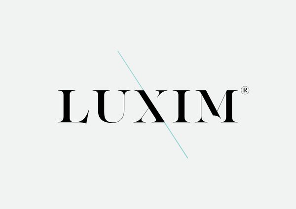
Minimal Logo Design for LUXIM
You have to admire brands that connect pure graphic design with naming and ultimately business outcomes. It's really the pinnacle of commercial design, without a clear business outcome, it's really just a pretty picture. I love the minimal approach in this concept. So simple but seems to harness some sort of visual energy through the font and diagonal line.
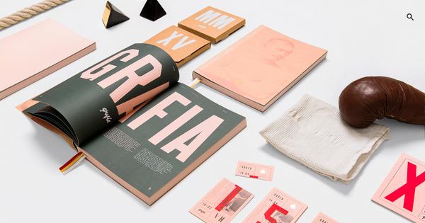
Editorial layout and graphic design by Kuudes : Vuoden Huiput XV
This stunning piece of graphic design was created for the Finnish association for visual communications designers. This concept by Kuudes references boxing iconography and was designed for Finland’s most significant annual creative design competition. The high impact editorial layout direction has been easily adapted across channels, including printed materials, online content and event materials.
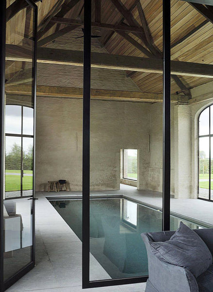
Modern Farmhouse Architecture
Architect Vincent Van Duysen has completely transformed this 19th-century farmhouse into a modern day architectural masterpiece, ”I wanted to reinterpret the classic Flemish country house.” says Van Duysen.
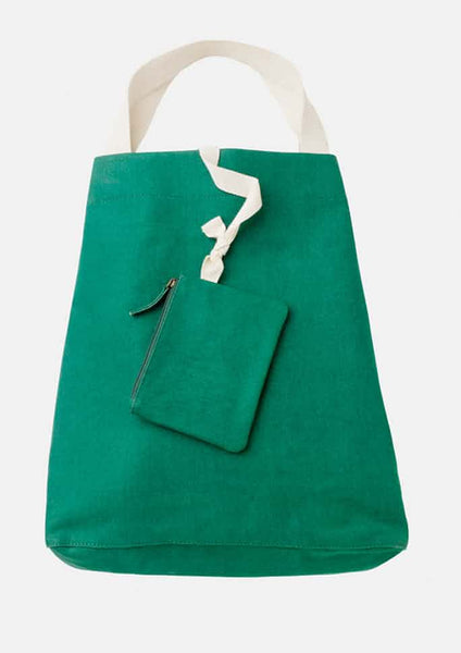
Minimal Canvas Bag Design
This cool green canvas beach bag really hits the mark with it's minimal design approach. This one comes in three colours – green, red and yellow and is available here at fashion store Toast
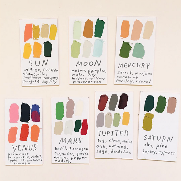
Graphic art
For years the world of fine art has been a source of inspiration for both fashion and graphic designers. The uninhibited and expressive nature of this work can provide a unique ignition point for many creative explorations and ideas.
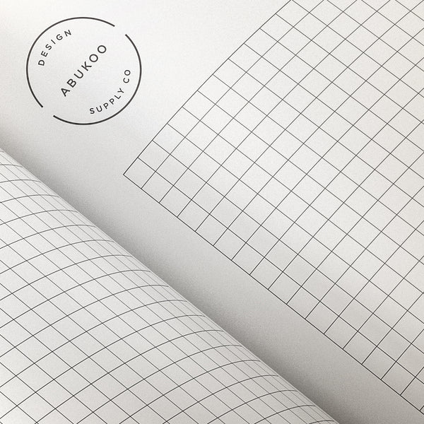
Printable Graph Paper
This range of printable graph papers are the perfect addition to your DIY design kit. The grid paper selection features 3 different grid sizes, plus a bonus dot grid template. The sheets are ideal for sketching plans or creating your own DIY designs.
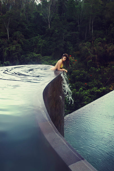
Amazing hotel pools
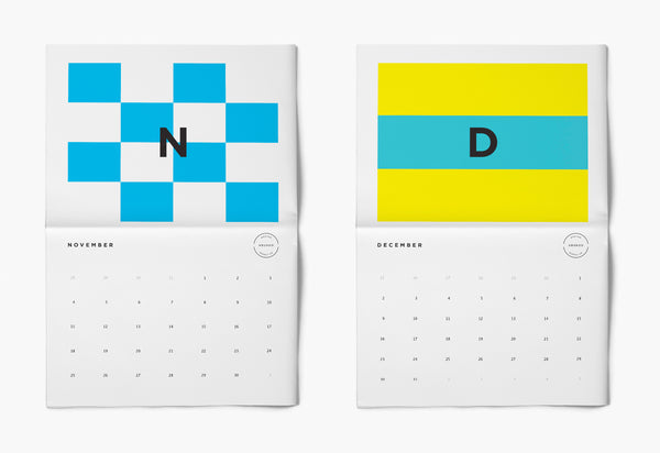
Insanely beautiful nautical calendar design (2018)
The latest Abukoo calendar designs have arrived for 2018. These DIY calendars are the easiest way by far to track the year in total style. The best thing is they are completely free.
Visit the Abukoo Website to get the Printable Calendar Download
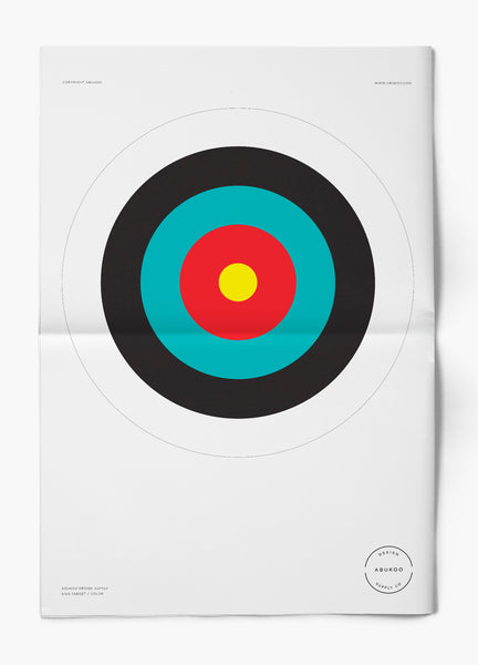
Abukoo Printable Targets
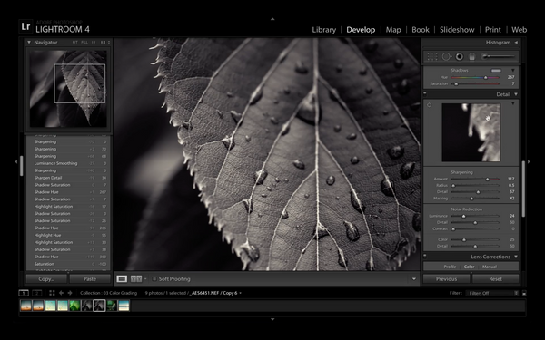
Lightroom Tutorials - Getting Started
If you are looking to get started with Adobe Lightroom (LR4, LR5 or Lightroom cc), then this video tutorial is a great place to begin. It focuses on how to use Lightroom in a creative, non destructive way. There is an in-depth tutorial on how to use the develop module, covering exposure techniques, gradient filters, color grading and image sharpening.
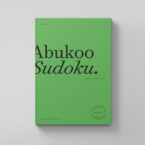
Printable Sudoku | Free Download
If you or your kids love puzzles then you'll really like this free printable Sudoku download. It's beautifully designed and the perfect way to satisfy your puzzle cravings. The Abukoo store is now offering the worlds most popular puzzle game in a beautifully designed typographic format. It's been created in black and white for easy home and work printing. There are 4 puzzles per page, with answer sheets at the end (easy medium and hard).
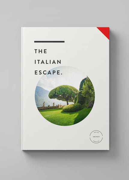
Inspiring Cover Designs
Here are a few of my favourite book cover designs. It's always fun seeing how my imagery will translate into a finished piece. Some of themes unlikely images can suddenly come to life when they are surrounded by some well considered graphic design and typography.
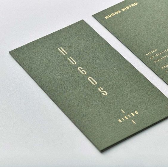
Business Card Design for Hugos Bristro
This beautiful design was created by Hannah Stout for the folks behind Odettes (another eatery that Hannah Stout worked on), Hugo’s is a cozy but sumptuous space with a interior fit-out all about tactility and understated luxury. The design challenge here was to mark out a clear identity for Hugo’s, while still maintaining a subtle connection to its “big sister” restaurant.
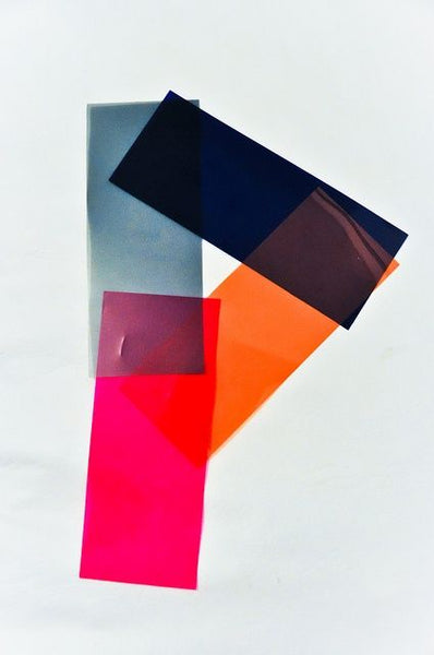
Graphic Typography & Numbers
I have been collecting graphic letters and numbers for a while and thought it was worth putting together a post with a few of my favourites. I'll be trying to add images to this post as I stumble across new reference material.
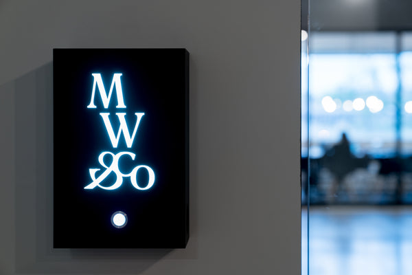
New Typographic Brand fro Mile Wright & Co
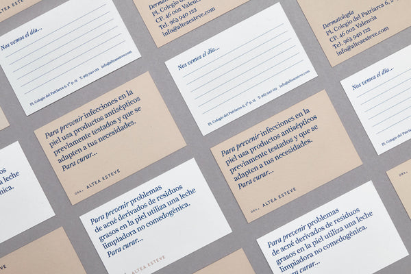
Minimal Business Card and Stationery Design

How to Create Minimalist Landscape Photography
I have been a huge fan of simple, well constructed, minimalist photography for a long time. As a graphic designer I lean towards this style because it connects well with other design elements. It creates the opportunity where typography and imagery to fuse nicely together, rather than fighting. I wanted to share a few key things I've learnt about how to get started shooting minimal landscape photography.
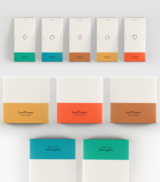
Inspiring Minimalist Branding and Visual Identity
This beautifully crafted visual identity and packaging concept by Amanda Mohlin redefines how a luxury product should look. It has colour, personality and style - but always delivers on an inspiring sense of understated class. The conceptual graphic approach for Luc & Louna showcases a selection of different flavoured chocolate, each with a minimal design and always leaving the chocolate as the hero.
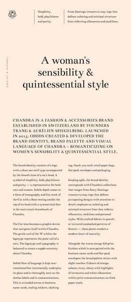
Chandra typography and design
This simple design layout for Chandra is a great example of classic styling and typography.
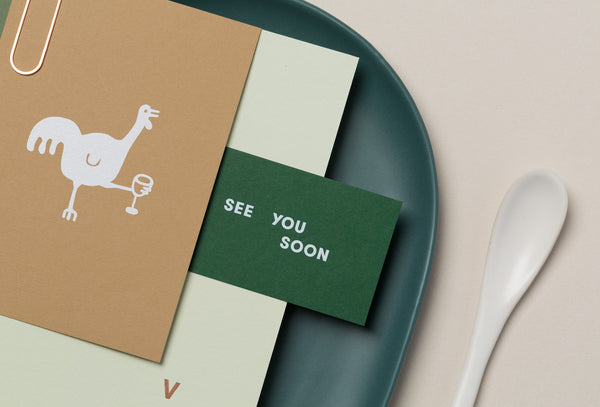
Inspirational graphic design for Stones Throw Restaurant and Bar
Stone’s Throw is an iconic bar and restaurant that recently under went a full renovation to bring it back to life in the form of a modern watering hole. The design strikes an incredible balance between quirky Illustration, simple texture and sophisticated colour combinations.
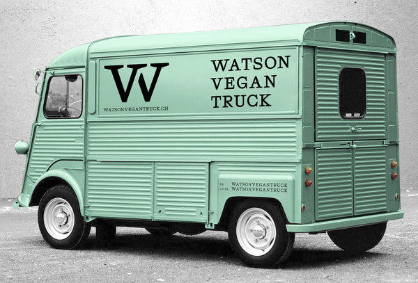
Brand Identity Design for Watson Vegan Truck
This new identity for Watson Vegan Truck captures a unique style for the edgy vegan food market. It takes on a slightly retro premium feel, with incredible use of typography and colour. The graphic simplicity of the word mark and monogram feel effortlessly cool. The translation of the design through to vehicle signage and menus is a stroke of genius, I'd definitely stop to sample a burger if I saw this design - and I'm not even Vegan!
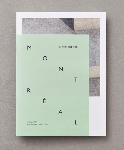
COS MONTREAL SPECIAL PUBLICATION
A beautiful example of what you can still do with the printed projects. The design of this special edition brochure celebrates the store opening by exploring some of the city’s inspiring places. It was given away on opening night - nice work guys looks great.
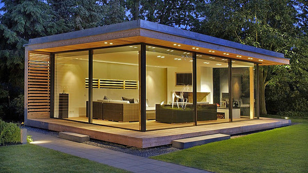
Stunning KELLER minimal windows
These incredible minimalist window frame designs by Keller open up a whole variety of architectural features for designers. The frame profile is reduced to allow seamless integration into floor, ceiling and walls. It means the glass can take up to 98% of the area giving incredible light flow and near perfect finish. It also seems to substantially reduce the border between glass doors and helps minimise overly heavy appearance of vertical mullions. The office pod design was produced by Podspace
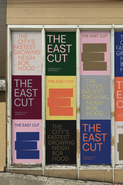
The East Cut brand identity and graphic poster design style
The East Cut is a brand new neighborhood in downtown San Francisco. It's designed to unify these disparate areas into one vibrant modern community.
